The Challenge
Geojit is a leading retail financial services company listed on the NSE and BSE, offering a wide portfolio of investment solutions across equities, derivatives, mutual funds, insurance, and fixed deposits.
With a growing presence and a large customer base, the brand required a clear and consistent identity system that could reflect its credibility and scale while ensuring uniformity across all communication touchpoints.
The Strategy
The approach focused on building a strong and cohesive identity system that aligns with the brand’s core values of trust, stability, and growth. Every element of the brand was structured to ensure consistency across platforms, from corporate communication to digital and physical applications. The objective was to create a system that simplifies usage while strengthening recognition.
The Idea & Identity
The identity was built around the core essence of the brand.
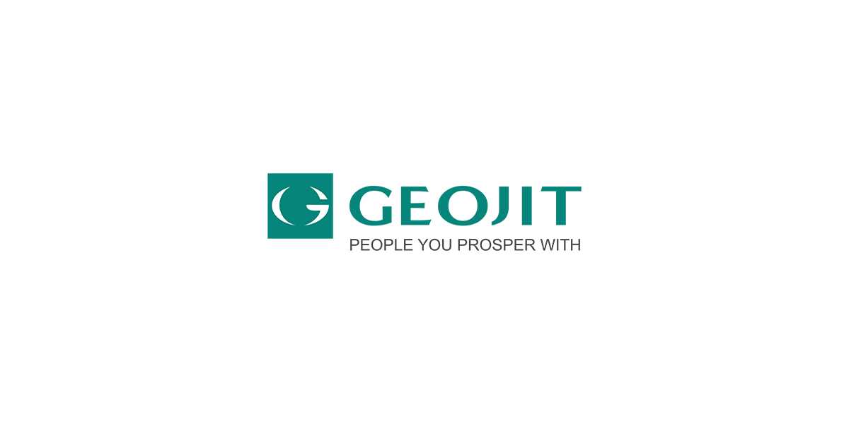
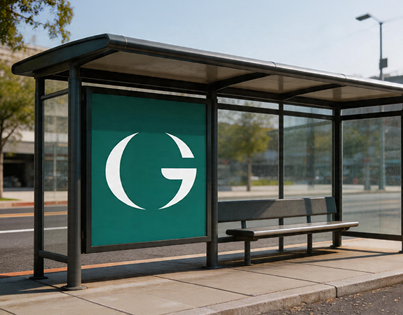
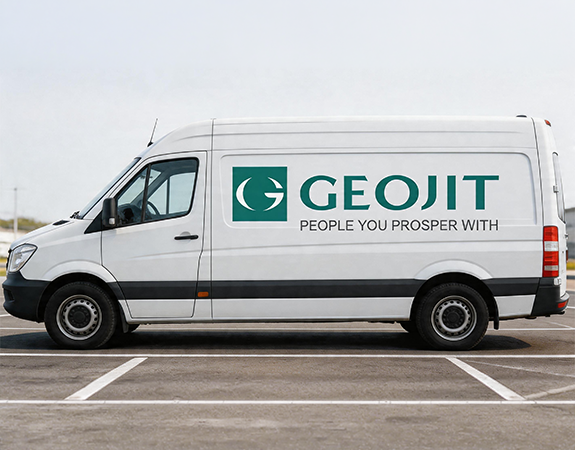
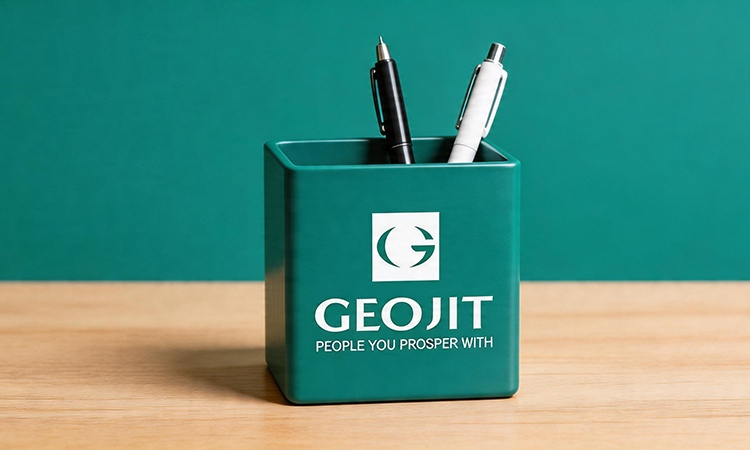
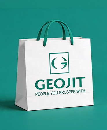
Logo Concept
The Geojit logo is constructed on a square form, representing stability and equality.
The ‘G’ forms a spherical shape, symbolising the globe, reflecting the brand’s presence and outlook. An arrow-shaped end signifies growth in investments.
The soft curvature of the globe represents knowledge, presence, and investment strength. The wordmark uses a bold and sturdy typeface to emphasise strength, stability, and trust.
Tagline
“Invest for Life” was integrated as a consistent brand sign-off, reinforcing the long-term, trust-led relationship Geojit builds with its customers.
Colour Palette
The primary green represents wealth and financial stability.
A structured secondary colour palette supports data, charts, and infographics across communication.
Typography
A defined typographic system using Gotham ensures clarity and consistency across brand materials, supported by system fonts for digital and presentation use.
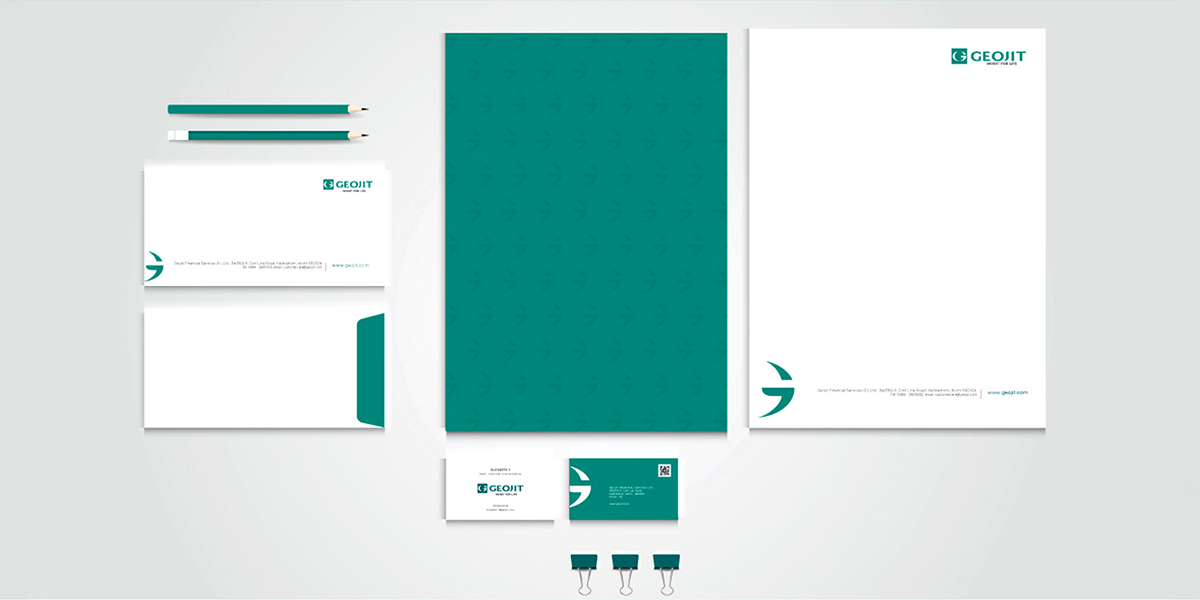
Visual Language
Graphic elements derived from the logo extend into the broader identity system, ensuring continuity across collaterals.
Imagery guidelines focus on natural, real, and emotionally relevant visuals that reflect the brand’s values, avoiding artificial or staged representations.
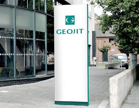
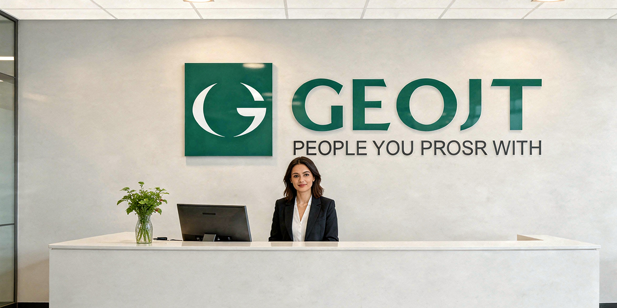
Clear rules for logo usage, safe zones, and restrictions ensure the identity remains consistent and uncompromised across applications.
The Outcome
Geojit emerged with a well-defined and structured brand identity system. The new system ensures consistency across all touchpoints, strengthens visual recognition, and reinforces the brand’s core values of trust, stability, and growth.
The result is a cohesive identity that supports Geojit’s scale, credibility, and long-term presence in the financial services space.