Brand Purpose
Chai Point, a brand dedicated to elevating the everyday chai experience, sought a comprehensive rebranding to express its true essence and future ambition of becoming synonymous with the experience of tea in India.
The objective was to contemporise the brand while infusing it with cultural depth, positioning Chai Point as an iconic and enduring presence in the beverage landscape.
Brand Strategy
The rebranding was approached as a holistic brand transformation, ensuring consistency across touchpoints and clarity of purpose.
The strategy encompassed the development of a renewed brand positioning and market approach, the creation of a refreshed visual identity aligned to the brand’s cultural roots and modern aspirations, and the design of packaging that reflected both familiarity and relevance.
Strategic inputs were provided to strengthen the product range, ensuring alignment with the brand’s evolving narrative. The new identity was translated seamlessly into retail spaces, creating environments that felt immersive, recognisable, and distinctly Chai Point.
Brand marketing and growth planning frameworks were developed to expand reach, reinforce recall, and support long term brand equity.
Brand Positioning
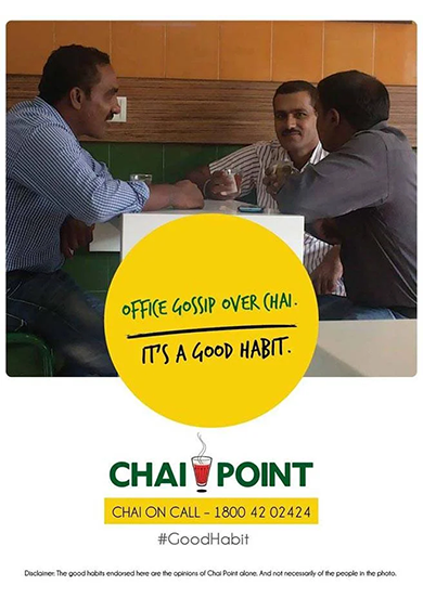
Chai Point is positioned as more than a tea brand. It stands as a cultural constant in everyday Indian life.
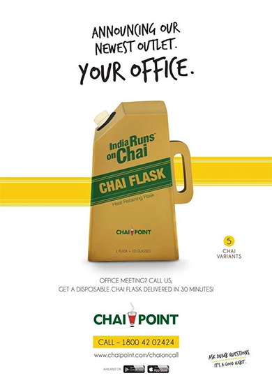
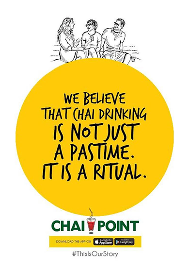
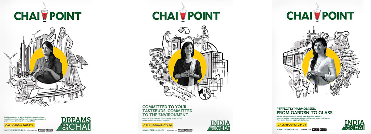
At the heart of the brand lies a simple yet powerful insight. Chai is the universal language of breaks, a shared ritual that fuels conversations, routines, and moments of pause across the country. The statement India Runs on Chai elevates tea from a daily beverage to a life force that keeps the nation moving.
The Idea
Chai, the universal language of breaks, is woven into the rhythm of everyday life in India. More than a beverage, it is the fuel that sustains a billion people through the pace and pressures of daily living.
Brand Identity
By integrating this insight into the brand’s core, we crafted a food and beverage identity anchored in cultural truth. The idea gave rise to the line India Runs on Chai, positioning Chai Point as a brand that understands tea not just as a product, but as a shared national habit and emotional anchor.
The rebranding aimed to build a culturally rich and resonant brand, firmly establishing Chai Point as an iconic presence within the beverage category.
For a food and beverage brand, visual identity plays a critical role in conveying sensory cues and emotional meaning. At Chai Point, the brand message was integrated across identity design, packaging, retail environments, and marketing communication.
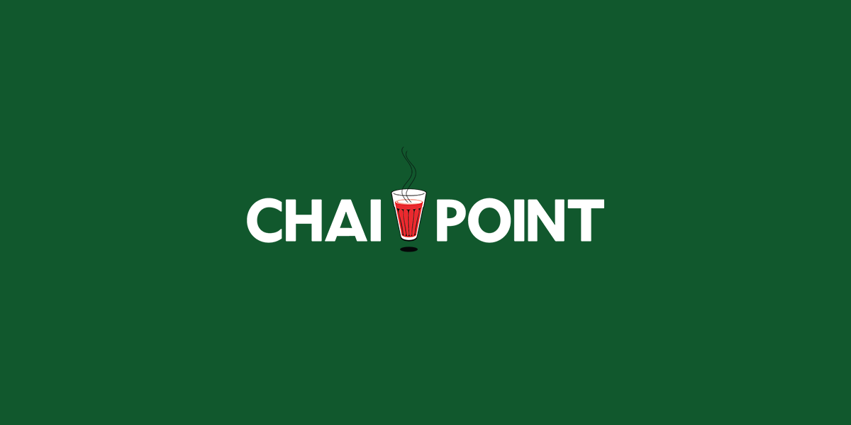
The logo and visual language were designed to balance tradition with modernity, reflecting the brand’s cultural roots while remaining contemporary in expression.
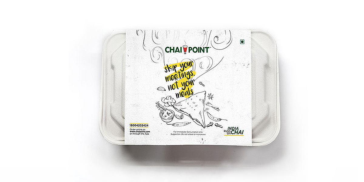
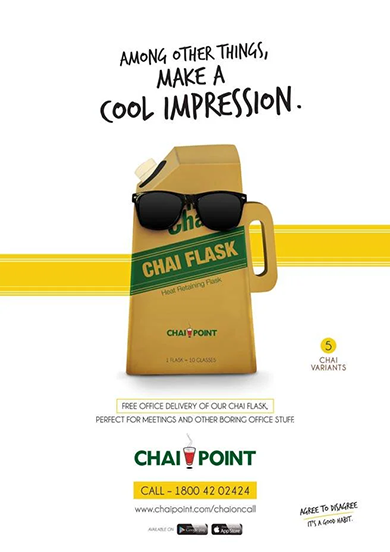
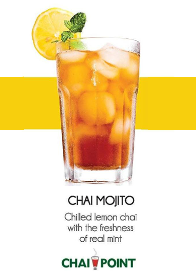
Packaging was crafted to connect instantly with the target audience, using familiar cultural references combined with clean, modern aesthetics.
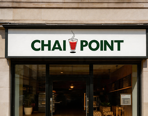
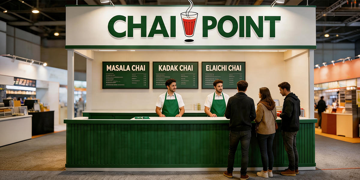
Retail spaces were translated to reflect the renewed identity, creating consistent, immersive experiences that reinforced brand recognition.
The colour palette is centred around Chai Point’s signature green and yellow. Doodles and hand-drawn sketches of food elements were incorporated into the packaging, creating a distinctive and memorable visual language rooted in warmth and familiarity.
Impact
The rebranding positioned Chai Point as a culturally rich and recognisable brand within the beverage industry, strengthening its relevance and aligning it with its ambition of becoming synonymous with the tea experience in India.
By anchoring the brand in cultural insight and everyday ritual, the transformation enhanced recall, deepened emotional connection, and built long term brand equity.
The next time one reaches for a cup of chai, Chai Point stands as a reminder that building a household brand is as much about culture and emotion as it is about the product itself.