Brand Purpose
With over 25 years of legacy, Navodaya Educational Trust operates multiple institutions across expansive, well developed campuses in North Karnataka. Despite strong infrastructure and academic offerings, the group lacked visibility and differentiation, often blending into the clutter of regional colleges across Karnataka, Telangana, and Andhra Pradesh. The purpose was to elevate Navodaya as a distinctive group of institutions and present a compelling, unified face to the outside world.
Brand Strategy
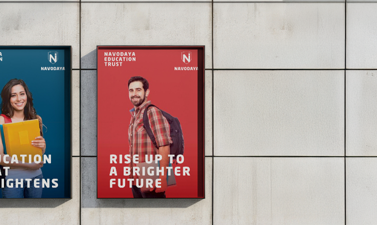
The strategy focused on creating a clear and aspirational umbrella identity that unified all Navodaya institutions. Rather than competing on location or scale, the brand was shaped around student centric growth and long term development. Communication emphasised learning beyond classrooms, blending academics, campus life, and personal development. A consistent narrative was built across all touchpoints, balancing Navodaya’s heritage with a confident, future ready outlook.
Brand Positioning
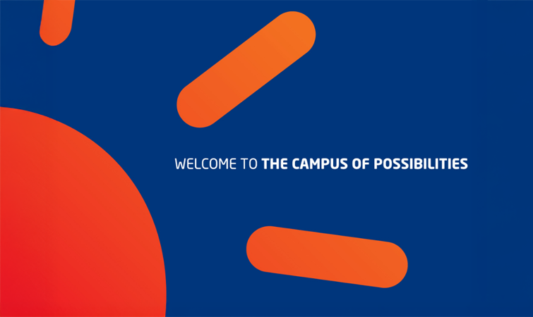
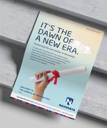
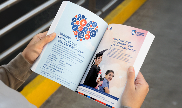
Navodaya Education Trust is positioned as The Campus of Possibilities, an institution group that offers more than degrees. It stands for an environment where education, personal growth, and community coexist, enabling students to build capability, confidence, and direction in a supportive campus setting.
The Idea
The central idea was to present Navodaya as a place where learning and living come together seamlessly. By focusing on opportunity rather than location, the brand reframed the campus as a space that nurtures ambition, exploration, and holistic development. This idea became the foundation for how Navodaya speaks, looks, and engages with students and parents.
Brand Identity
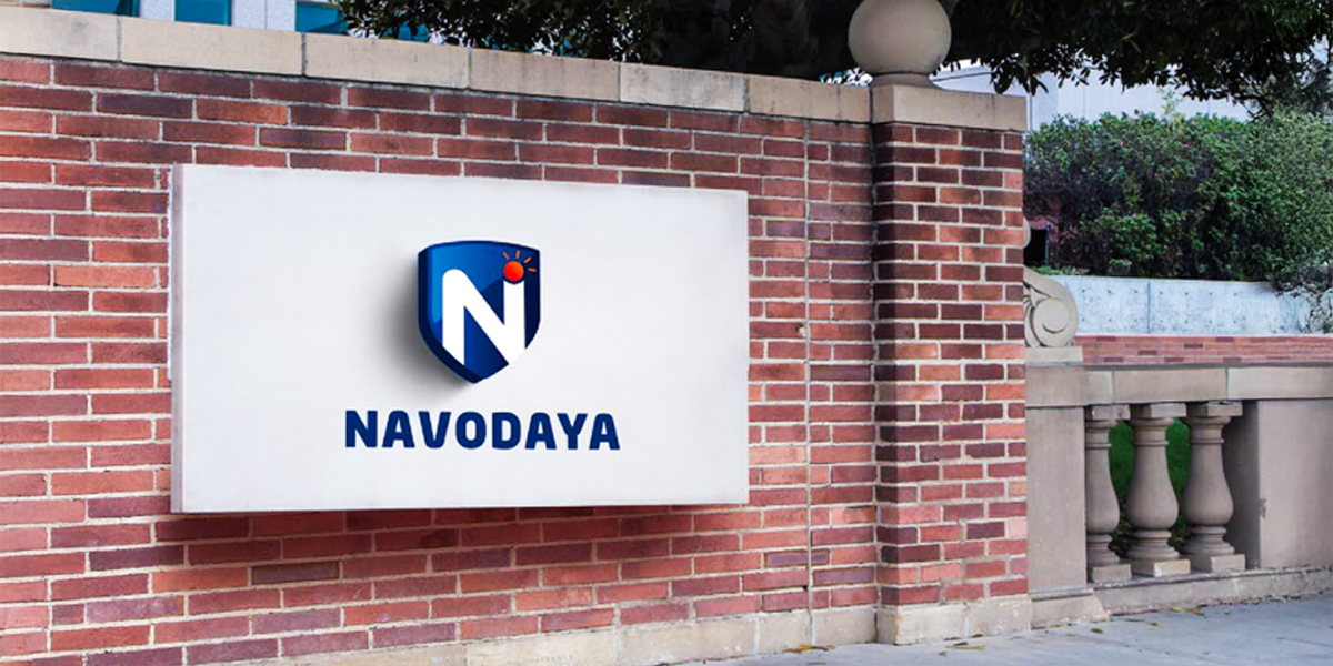
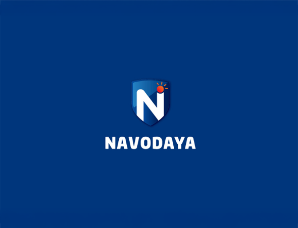
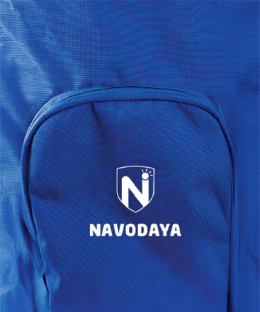
Logo Construction
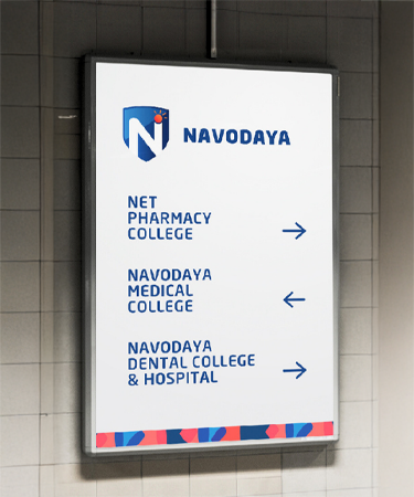
A shield shaped mark symbolises trust and protection. The letter N represents growth and leadership, while the rising sun signifies knowledge and new beginnings.
Colour Palette
Blue conveys trust, stability, and academic excellence, complemented by warm orange and red accents that express energy, optimism, and care.
Typography
Clean, modern sans serif typefaces ensure clarity, confidence, and approachability across applications.
Design Philosophy
Simple and purposeful, blending heritage with modernity to support learning, growth, and credibility.
Brand Expression
Warm, inclusive, and aspirational, consistently reinforcing the idea of The Campus of Possibilities.
Pattern System
Subtle, repeatable forms symbolise continuity and growth while maintaining a cohesive visual language.
Impact
The refreshed brand repositioned Navodaya Educational Trust as a credible and aspirational group of institutions, shifting attention from geography to opportunity. The unified identity improved recognition, strengthened trust, and helped the group stand apart in a crowded regional education landscape. By clearly articulating its promise of growth, care, and possibility, Navodaya established itself as a destination where students can confidently shape their futures.