Polar Bear has always been more than an ice cream parlour—it’s a space for joy, comfort, and togetherness. Our role was to shape this into a clear ice cream brand strategy that could help Polar Bear expand beyond nostalgia, reaching a younger, experience-driven audience while staying true to its legacy.
Brand Strategy
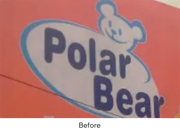
With over a decade of presence in Bangalore, Polar Bear stood at the edge of expansion. The challenge was to preserve the warmth of its past while making the brand relevant for a new generation of consumers.
Our premium ice cream branding approach focused on:
Shifting the narrative from “an ice cream shop” to “the home of sundaes.”
Infusing energy and spontaneity with a modern ice cream brand design.
Future-proofing growth with a scalable system for new markets and formats.
This was not just a visual refresh but a repositioning exercise—one that showed why branding for ice cream companies has to go beyond flavours and focus on emotions.
Brand Positioning
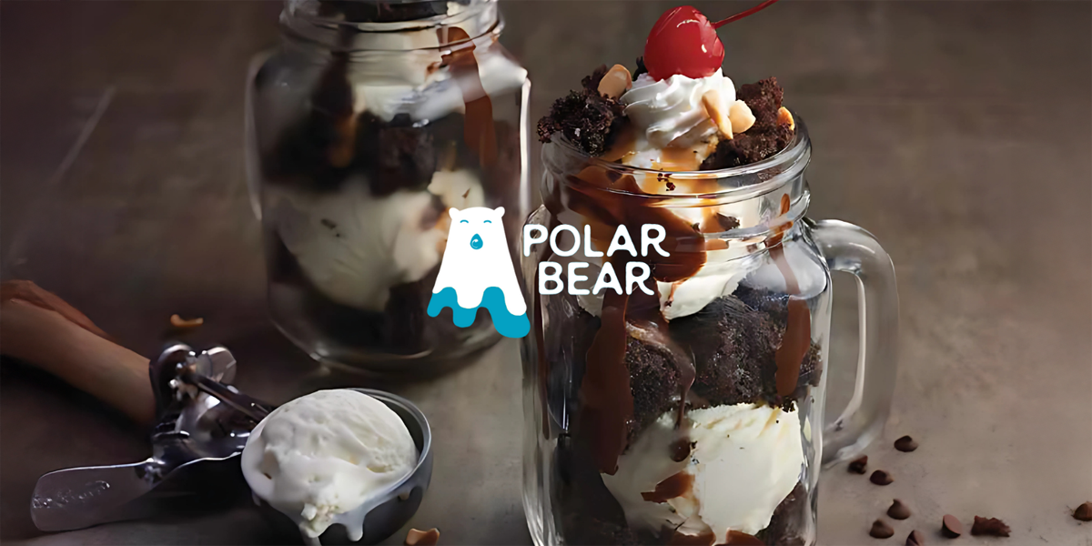
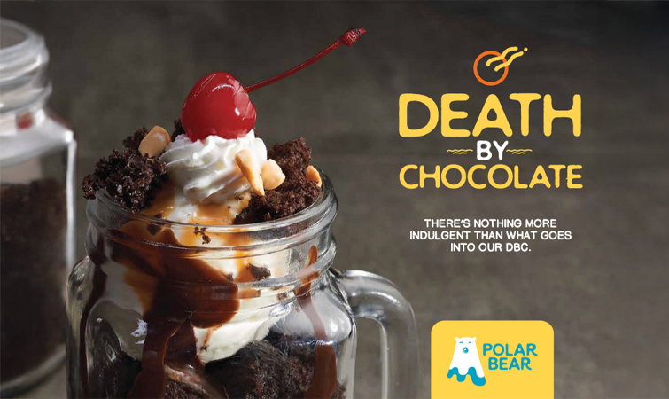
Polar Bear is positioned as The Home of Sundaes—a premium-yet-fun ice cream destination that transforms everyday moments into celebrations.
Positioning pillars:
Everyday Joy – Not reserved for weekends or special occasions, but for any moment.
Inclusive Celebration – A brand that welcomes families, friends, and solo indulgences alike.
Youthful Energy – Vibrant, bold, and contemporary without losing its warmth.
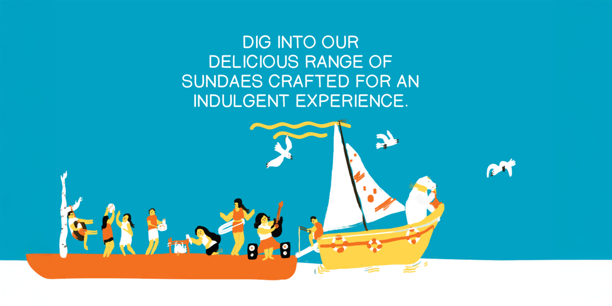
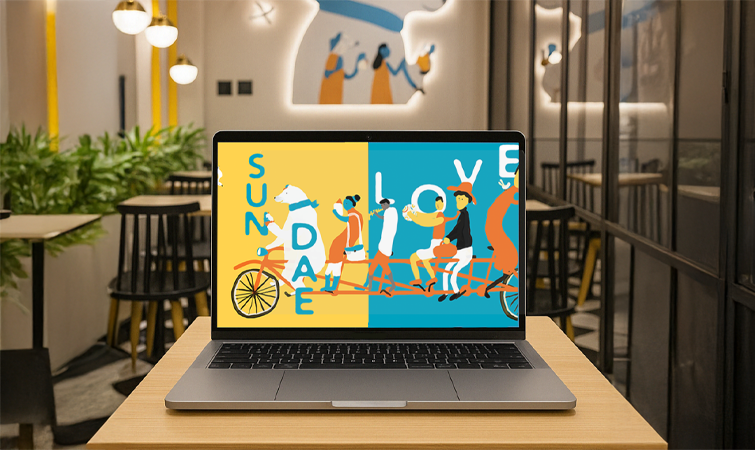
The Big Idea
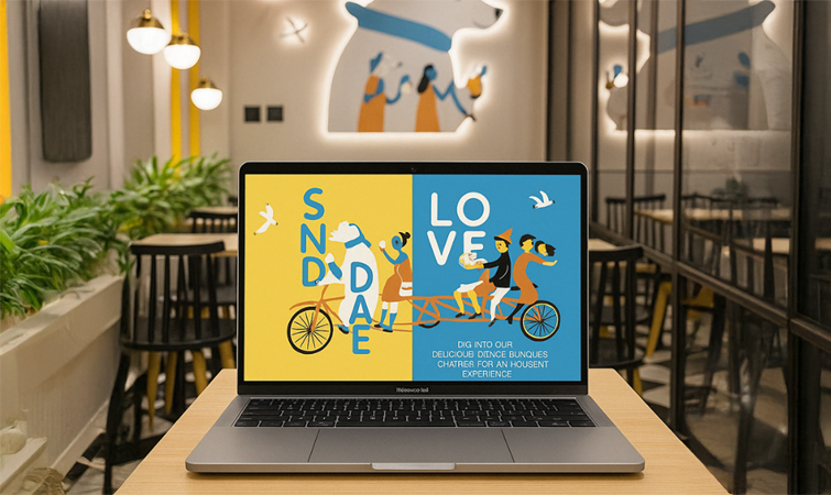
“Sundae & Sunday.” Sunday is joy, excitement, the day everyone looks forward to. Sundae is the sweet reminder of that feeling, any day of the week. By uniting the two, Polar Bear became more than dessert—it became a philosophy of everyday celebration.
Key Messages
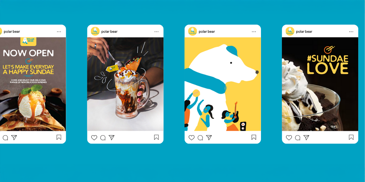
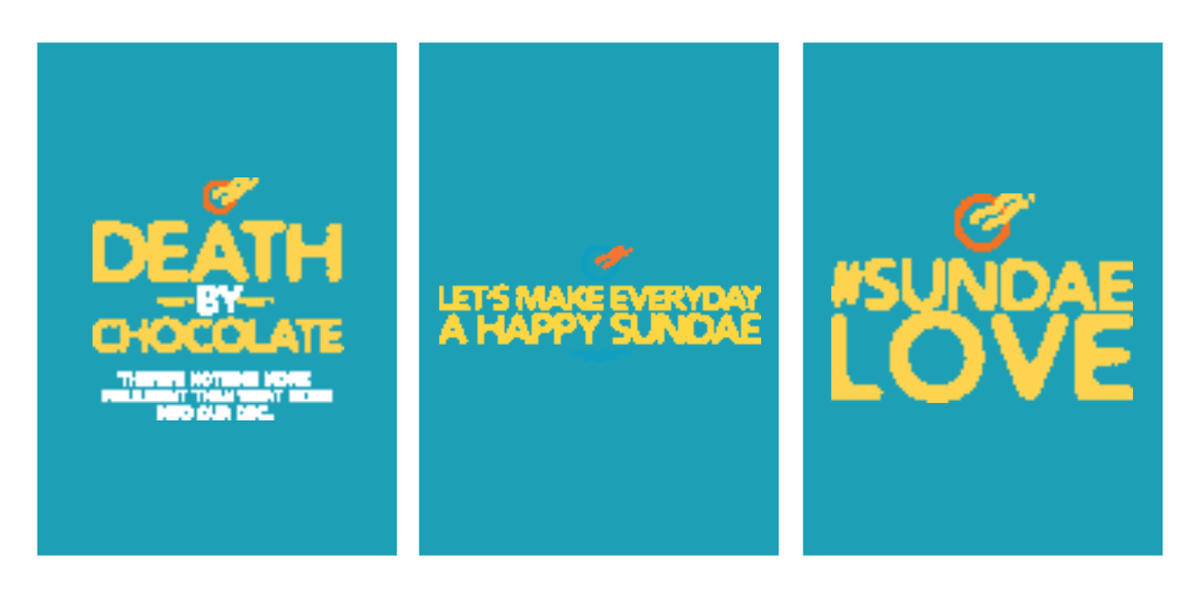
Sundaes aren’t just desserts—they’re celebrations.
Every day can feel like a Sunday.
Polar Bear -The home of sundaes.
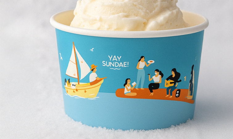
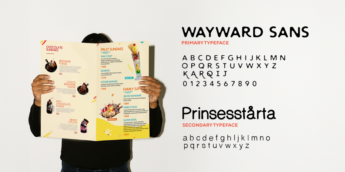
Brand Identity
The visual identity translated the Sundae & Sunday idea into a fresh design system:
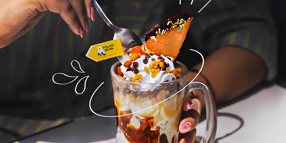
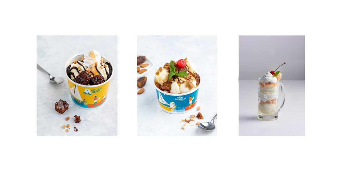
Logo: A custom logotype with rounded curves echoing the smoothness of scoops.
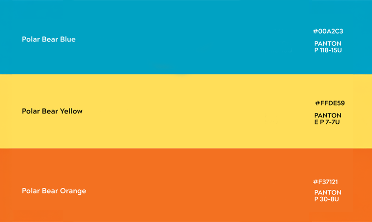
Colour Palette: Neapolitan-inspired tones with vibrant accents—perfect for packaging for ice cream brands.
Patterns: Playful, sprinkle-like designs adding energy across touchpoints.
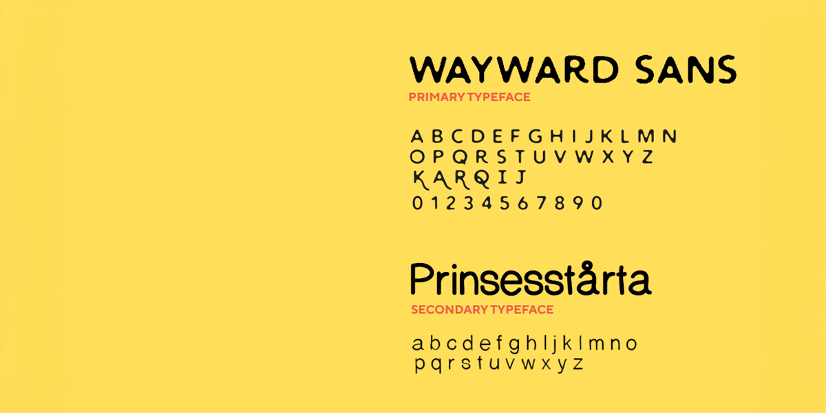
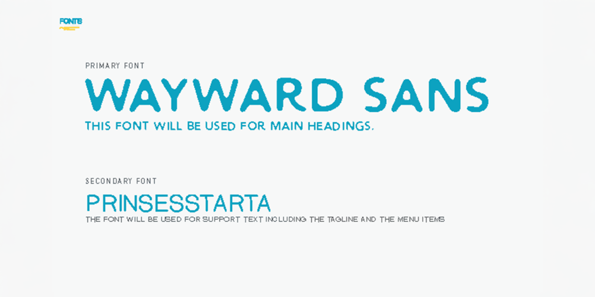
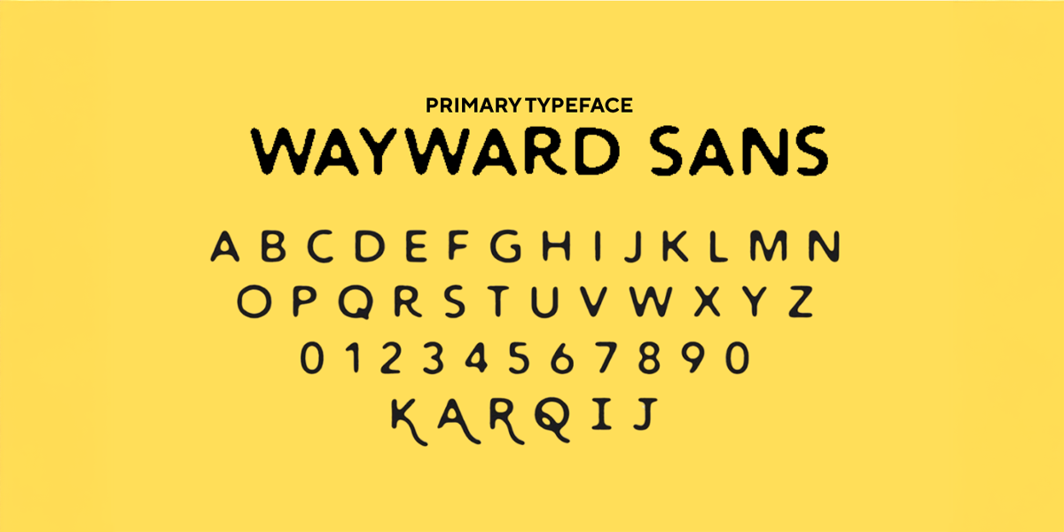
Typography: Rounded, contemporary fonts for approachability.
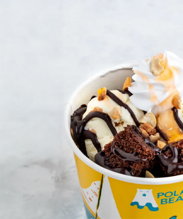
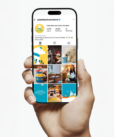
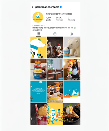
Applications: Custom ice cream packaging design, in-store graphics, and digital assets unified the brand.
Impact
The rebrand revitalised Polar Bear with a stronger emotional connection, broader reach, and higher footfall. The Sundae & Sunday philosophy gave the brand a scalable platform for expansion, proving how top branding agencies for ice cream in Bangalore can help transform a legacy chain into a modern lifestyle brand through design, strategy, and innovative ice cream marketing.