The Challenge
To create a compelling eSIM brand from the ground up. This included arriving at a name, defining a clear positioning, and building a distinctive identity in a category that is functional but lacks emotional connection.
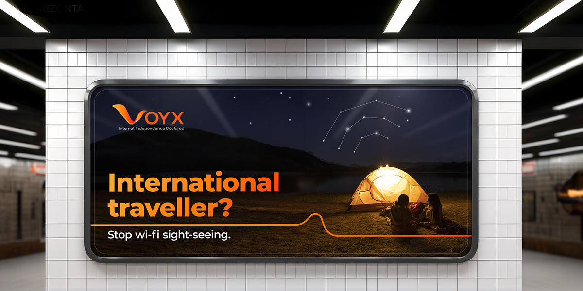
The brand needed to appeal to Indian travellers who value both seamless connectivity and the familiarity of dependable, “desi” service.
The Strategy
The goal was to position Voyx as an avant-garde, tech-driven solution and the preferred choice for Indian travellers seeking reliable global connectivity.
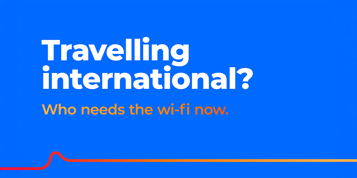
The brand was built around a simple but powerful tension. Indian travellers rely heavily on the internet, yet are dependent on Wi-Fi when abroad, often balancing cost with convenience.
Voyx resolves this by offering a cost-effective, reliable, and seamless eSIM solution that removes this dependency and delivers uninterrupted connectivity.
Brand Positioning
Voyx is positioned as a trusted companion for Indian travellers, offering reliable and consistent internet connectivity across borders. It is an avant-garde choice that combines innovation with dependability, giving users the freedom to stay connected wherever they go.
The Idea
Indian travellers are emotional and accustomed to care, comfort, and reliability.
Voyx brings this into a tech-driven space by offering a solution that goes beyond functionality. It becomes a companion that supports users wherever they travel, ensuring they are always connected without compromise.
At its core, the idea is simple:
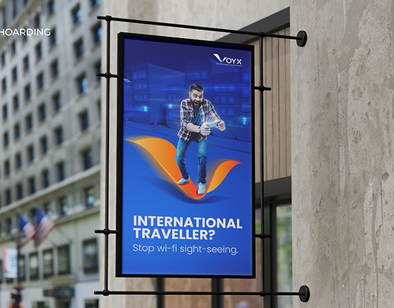
Freedom from Wi-Fi dependency.
Brand Identity & Visual Language
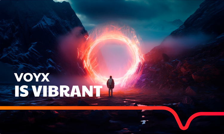
The identity captures the spirit of freedom, movement, and boundless connection.
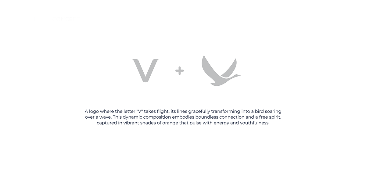
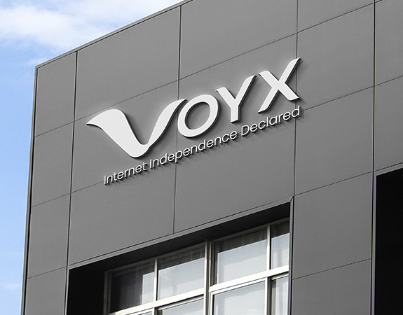
Logo Concept
The letter “V” takes flight, transforming into a bird soaring over a wave. This represents freedom, seamless connectivity, and the ability to move beyond borders without interruption.
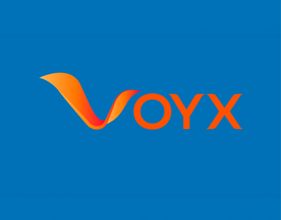
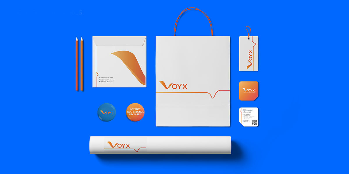
Colour Palette
Vibrant shades of orange bring energy, youthfulness, and a sense of movement, reflecting the brand’s dynamic and forward-looking nature.
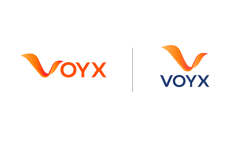
Typography
Montserrat is used as the primary typeface, creating a clean, modern, and highly legible system across digital and print.
Visual Expression
The overall language is vibrant and dynamic, reinforcing the idea of exploration, connectivity, and freedom.
Brand Expression
Indians have a deep reliance on the internet and do not want to lose that connection while travelling. At the same time, they are price-conscious.
Voyx addresses this by ensuring travellers can stay connected without being dependent on Wi-Fi, offering both convenience and affordability.
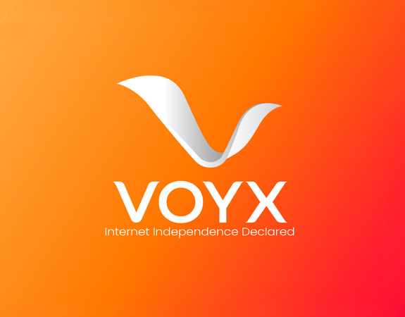
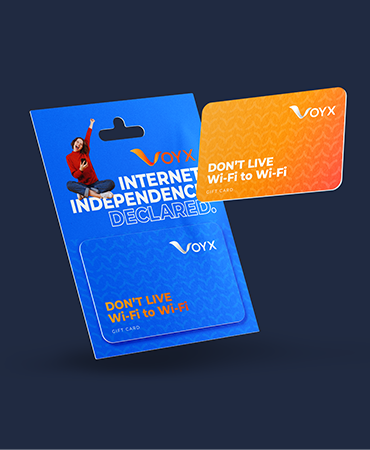
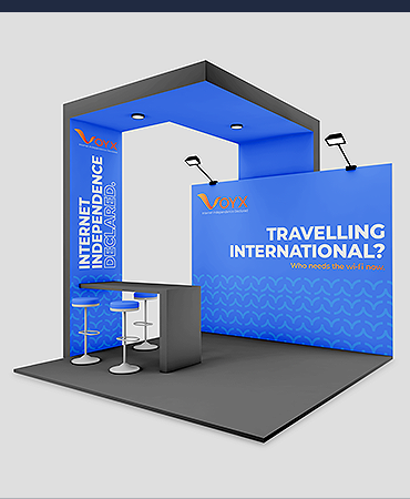
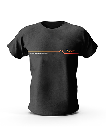
Internet Independence Declared
The Outcome
Voyx was introduced as a brand that embodies freedom in every sense, from its positioning to its identity.
From naming to visual expression, the brand reflects a seamless, reliable, and empowering connectivity experience, enabling Indian travellers to stay connected anytime, anywhere.