Brand Purpose
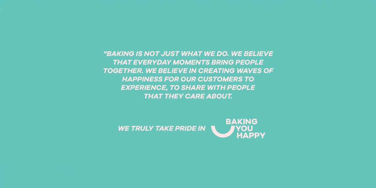
The transformation went beyond a visual refresh to create change from within. Anchored in the purpose You find the people, we will give you a reason, the brand expanded its focus from special occasions to everyday moments of joy. The product range and brand experience were reworked to encourage frequent, meaningful connections, laying the foundation for a strong and human centred brand idea.
Brand Strategy
The strategy repositioned The Muffin House from a classic bake house to an everyday happiness brand. While retaining the trust built through years of legacy, the brand was evolved to appeal to younger audiences through warmth, relevance, and emotional connection. The idea of Baking You Happy became the central guiding thought, shaping spaces, interactions, and communication. Rather than competing on products alone, the brand differentiated itself through experiences, community building, and long term emotional value.
Brand Positioning
The Muffin House is positioned as a brand that brings people together by creating reasons to connect. It turns everyday moments into shared experiences, going beyond baked goods to foster warmth, joy, and relationships. In a world of increasingly individualistic living, the brand stands for togetherness, happiness, and meaningful human connections, living by the promise You find the people, we will give you a reason.
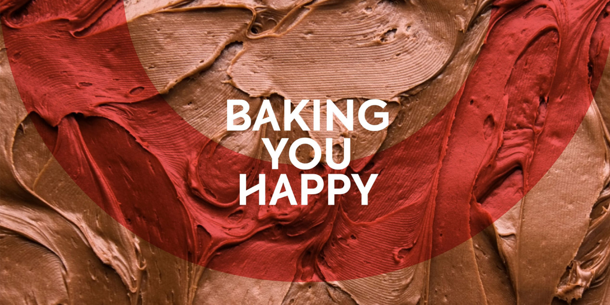
The Idea
In an increasingly siloed world, The Muffin House sought to revive the simple joy of togetherness. The upgraded brand celebrates people, encourages interaction, and creates spaces that feel welcoming and familiar. This led to the defining idea Baking You Happy, an expression of the brand’s belief in warm human connections and everyday joy.
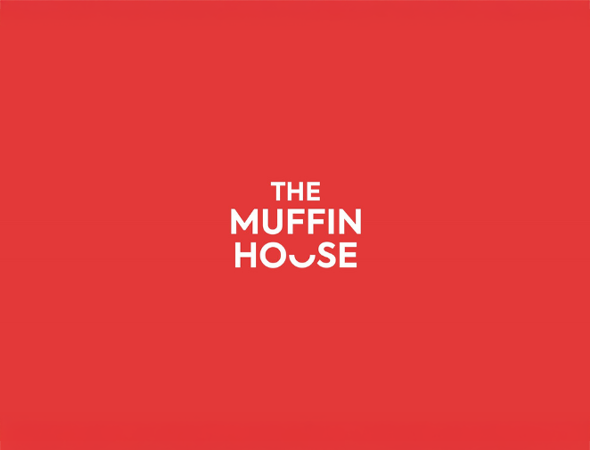
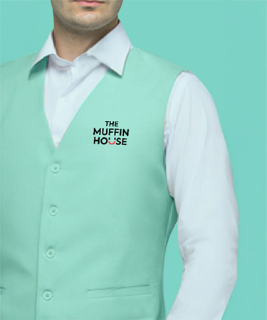
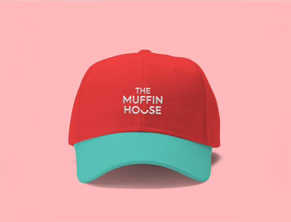
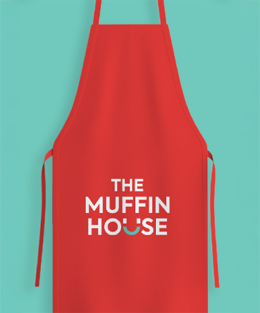
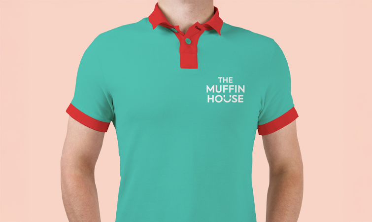
Brand Identity
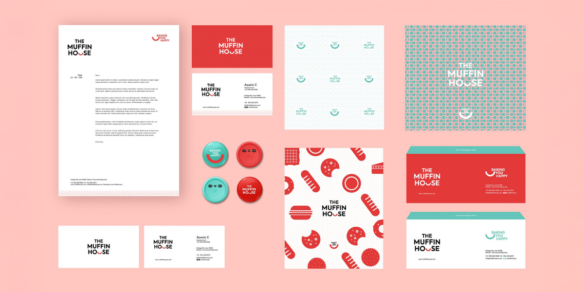
The idea Baking You Happy shaped the logo and the overall visual language, allowing the brand to present itself with clarity, warmth, and confidence in its new avatar.
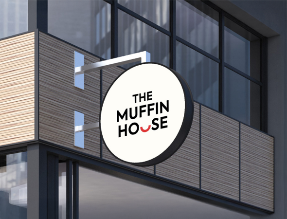
Logo Construction
A clean circular form symbolises unity, togetherness, and completeness. The bold uppercase wordmark ensures strong visibility, while the smile element below represents happiness, warmth, and human connection.
Brand Expression
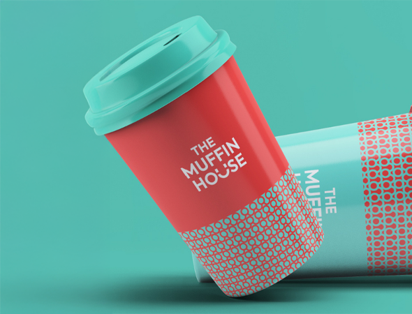
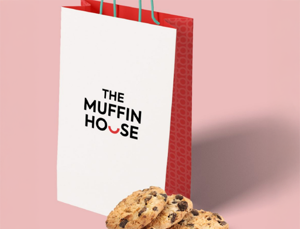
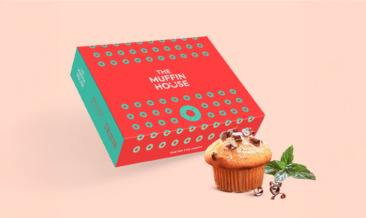
A modern bakery identity that celebrates people as much as products, communicating joy, togetherness, and everyday moments.
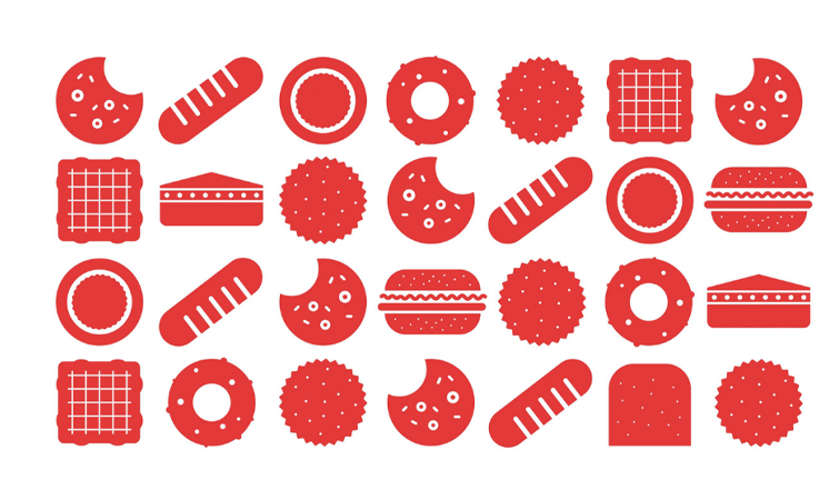
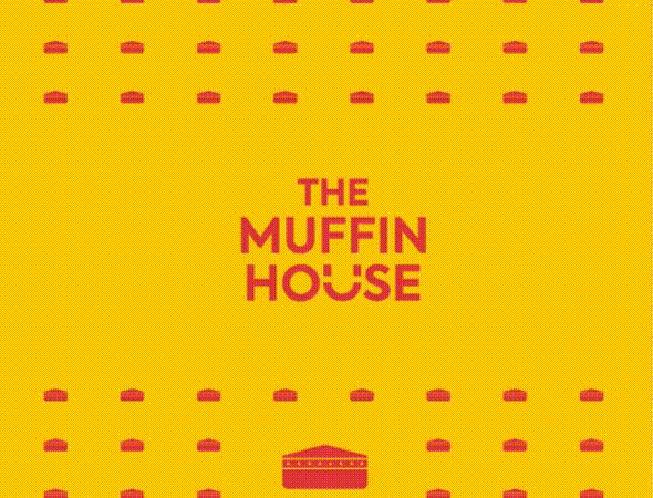
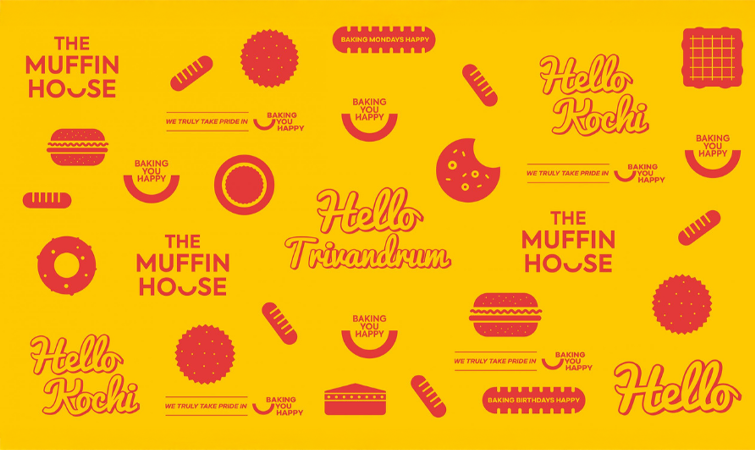
Pattern System
Subtle, repeatable graphic elements inspired by the smile curve, expressed through linear and geometric forms for a contemporary feel.
Design Philosophy
Minimal in approach yet rich in emotion, focusing on clarity, warmth, and connection over decorative excess.
Colour Palette
Black and charcoal convey strength and trust, while white and off white add freshness and simplicity. A red accent, used in the smile mark, introduces warmth, happiness, and appetite appeal.
Typography
Warm, friendly, and welcoming typefaces that feel contemporary while remaining rooted in tradition.
Impact
The reimagined Muffin House brand successfully transformed the bakery from an occasion led destination into an everyday source of happiness. By focusing on togetherness and emotional connection, the brand strengthened customer relationships and improved relevance among younger audiences while retaining legacy trust. The refreshed identity enhanced recall, encouraged frequent engagement, and positioned The Muffin House as a brand built on warmth, joy, and meaningful shared moments.