Brand Purpose
Maa Kauvery Hospital was conceived as a sub brand extension of Kauvery Hospitals, created to deliver a specialised healthcare experience for women and children. The purpose was to embody the warmth, care, and quiet assurance of a mother within today’s urban and often fragmented family structures.
The brand emerged from empathy and imagination, addressing an essential emotional need in metropolitan healthcare for mothers, babies, and families.
Brand Strategy
Developed under the trusted legacy of Kauvery Hospitals, Maa Kauvery was positioned as a specialised destination for mother and child care that extends beyond clinical excellence into reassurance, comfort, and holistic well being.
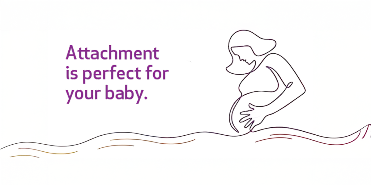
At the heart of the strategy was the idea of Maa, humanising the brand through the values of warmth, trust, protection, and emotional security, while preserving Kauvery’s established medical credibility.
The brand purpose was refined around life centric care, moving the focus from treatment alone to environments that support, guide, and empower mothers and families at every stage.
Maa Kauvery was positioned as a holistic care partner, integrating advanced maternity medicine with wellness programmes, emotional support systems, family friendly spaces, and preventive care.
A clearly differentiated identity was established within the Kauvery ecosystem, ensuring Maa Kauvery felt specialised and nurturing while remaining aligned with the parent brand’s quality standards, values, and reputation.
A calm, empathetic, and authoritative brand voice was developed across patient communication, hospital spaces, community engagement, and prenatal education initiatives.
Together, these efforts strengthened brand equity through a promise of safe beginnings, confident motherhood, and warm, family centred experiences.
Brand Positioning
Maa Kauvery Hospital is positioned as a trusted and holistic mother and child care destination that combines advanced medical expertise with nurturing and personalised support.
The brand stands for safe beginnings, emotional comfort, and lifelong care, embodying the role of an experienced and caring maternal figure who reassures, guides, and attends to every detail with quiet confidence.
The Idea
Every Maa Kauvery facility is thoughtfully designed around the needs of mothers, babies, and families. Care feels personal, safety feels assured, and each moment supports physical, emotional, and lifelong well being.
Maa Kauvery operates as a stand alone boutique unit, strengthened by the clinical depth and safety of a multi specialty hospital. The brand was imagineered through the lens of becoming the missing mother in an urban context, creating a seamless and credible extension from the parent brand to the sub brand.
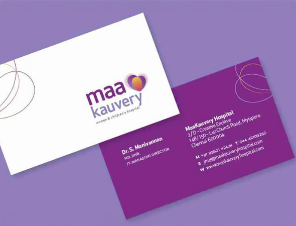
Brand Identity
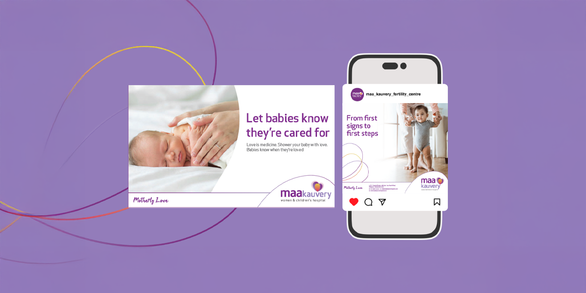
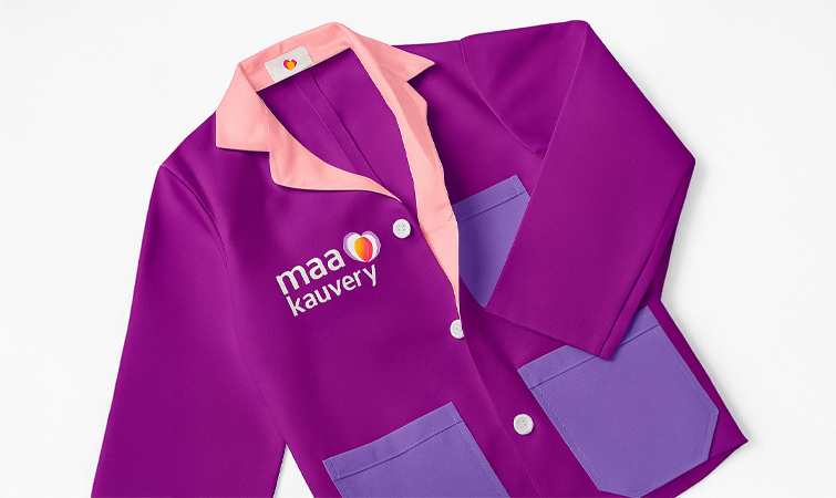
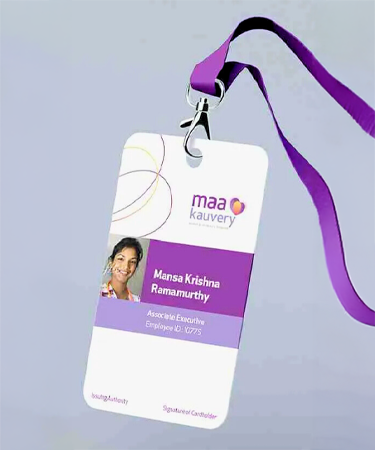
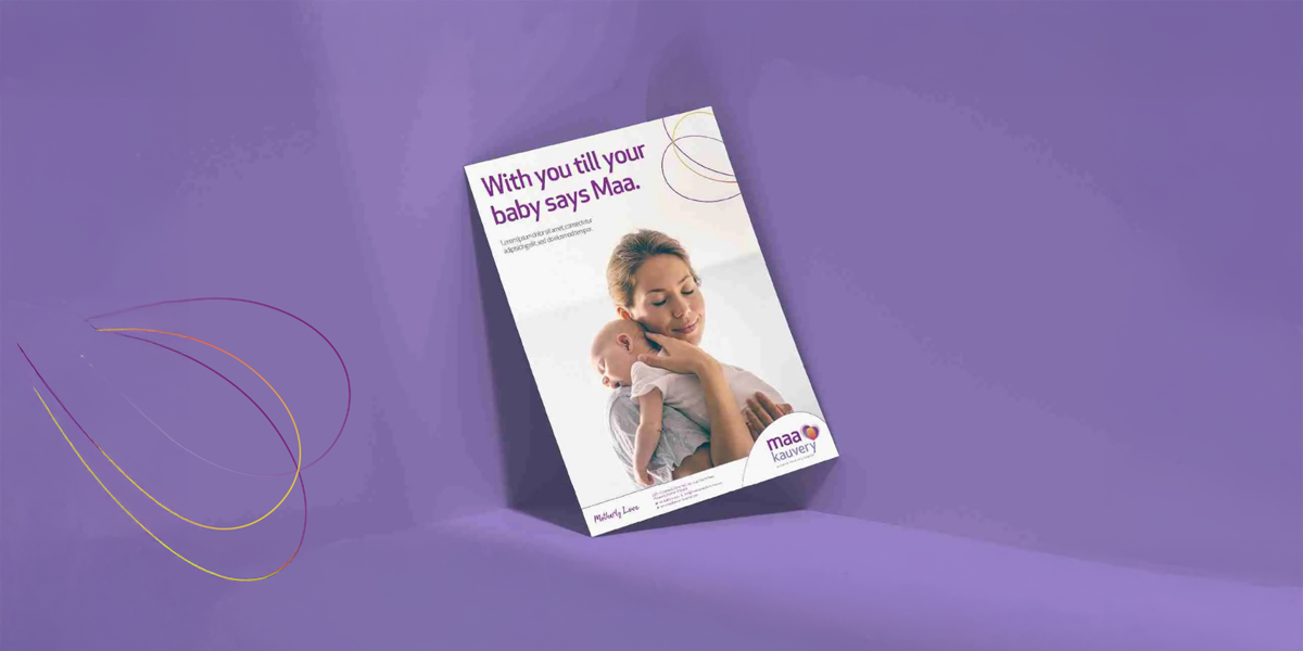
The Maa Kauvery identity expresses its core personality of motherly love. While remaining aligned with Kauvery Hospitals’ contemporary and approachable ethos, the identity moves beyond functional design to create warmth, reassurance, and emotional resonance.
A refined interplay of gentle hues conveys care, comfort, and trust throughout the visual language.
Logo Construction
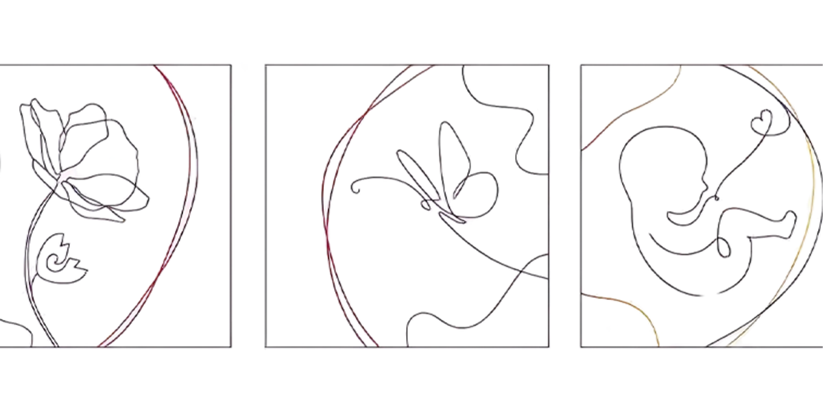
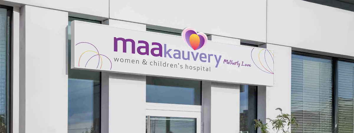
The logo brings together the symbolism of the heart and the womb, with the womb representing love in its most profound and life giving form. Layered semi transparent heart forms introduce a sense of movement, symbolising continuity and life.
An oval rendered in warm yellow, orange, and red tones signifies life within the womb. The placement of the womb within the heart forms a clear and enduring expression of motherly love and protection.
Brand Expression
Care that feels personal, comforting, and trustworthy from the first interaction through every milestone.
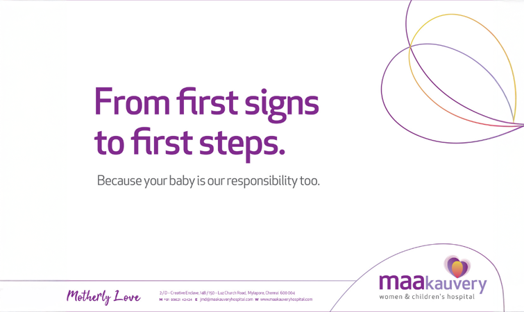
Pattern System
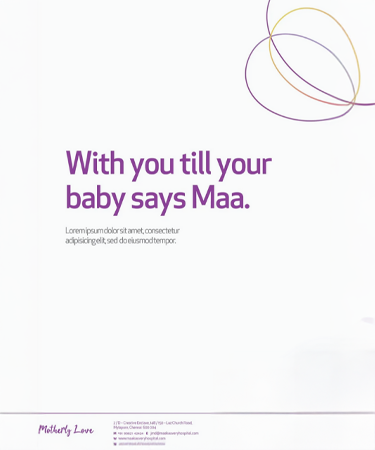
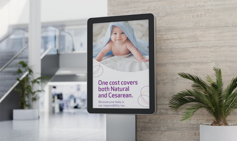
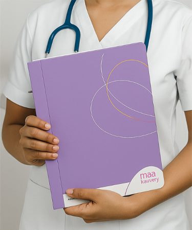
Soft curves, gentle waves, and nested forms reflect warmth, safety, and the intimate bond of motherhood. The shapes are rounded and restrained, creating a calm and reassuring visual rhythm.
Design Philosophy
The womb motif is repeated and mirrored to form an abstract brand pattern. By avoiding rigid edges, the design maintains a sense of softness, curiosity, and emotional flow.
Colour Palette
The six primary colours of Maa Kauvery balance vibrancy with softness, expressing a friendly yet refined new age healthcare environment.
Five secondary colours, derived from yellows, reds, and greys, extend the palette and allow for flexible gradient applications while maintaining visual harmony.
Typography
Handwritten typefaces were selected to introduce intimacy and warmth into the brand’s communication. The phrase Motherly Love is expressed using the Tahu font, reinforcing authenticity, tenderness, and human connection.
Impact
The sub branding established Maa Kauvery Hospital as a clearly differentiated and community focused extension of Kauvery Hospitals, while remaining firmly aligned with the parent brand’s reputation and values.
By building a brand platform grounded in purpose and emotional relevance, Bloombox enabled Maa Kauvery to strengthen patient trust, unify its service experience, and stand apart within its regional healthcare landscape.
This work demonstrates the value of well defined healthcare sub branding, where clarity, trust, and emotional connection are as critical as visual sophistication. Maa Kauvery went on to receive Bronze at the Big Bang Awards for its nuanced healthcare brand strategy.