The Challenge
IndigoEdge had evolved beyond being a traditional investment banking firm. The team believed their role extended far deeper than facilitating transactions or demonstrating business value.
Behind every deal was strategic thinking, resilience, collaboration, and the ability to stand beside founders through uncertainty and growth. The challenge was to create a brand identity that captured this spirit authentically while aligning the entire organisation around a shared vision and culture.
The objective was not only to refresh the brand visually, but also to articulate who IndigoEdge truly was and what it aspired to become.
The Strategy
The brand strategy focused on positioning IndigoEdge as more than investment bankers. The brand was built around the idea of acting like strategic co-founders who partner with ambitious entrepreneurs to create long-term value and lasting legacies. At the centre of the brand purpose was a clear belief:
To always create real value.
This strategic direction shaped the vision, culture, communication, and internal identity system of the organisation.
The framework was anchored through three core mindsets:
- The Truth Mindset
- The Growth Mindset
- The Wolf Mindset
Together, these principles defined how the team approaches opportunities, partnerships, and challenges.
The Brand Identity
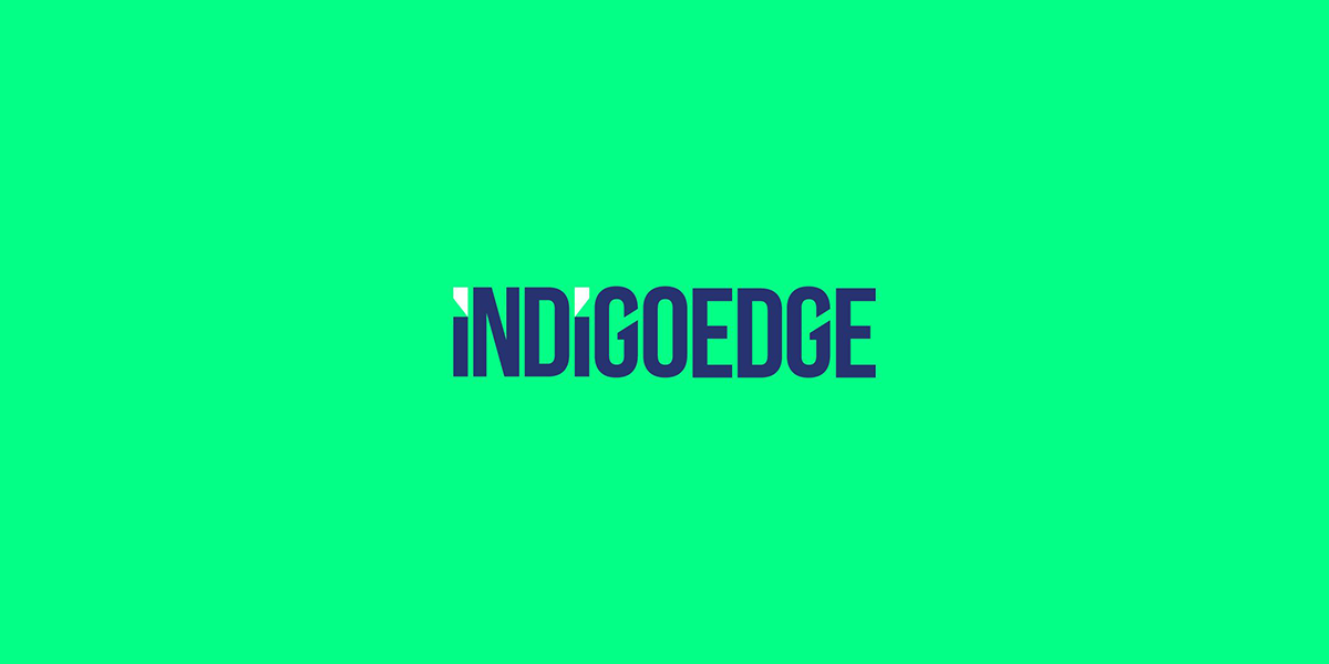
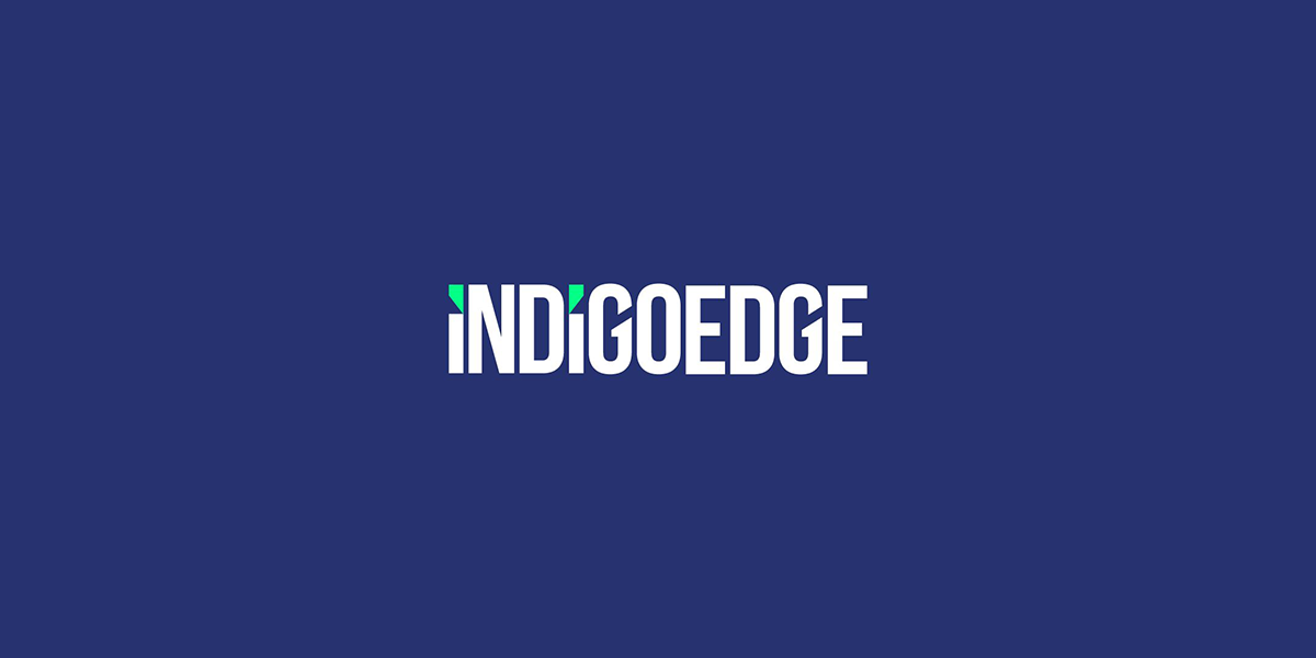
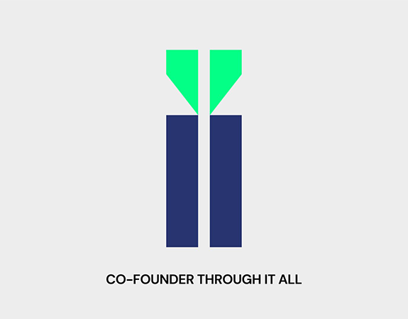
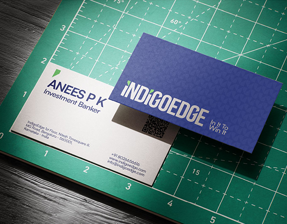
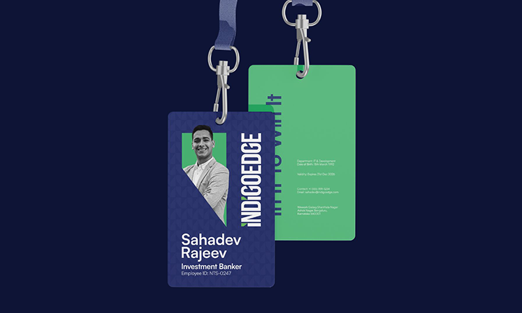
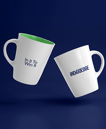
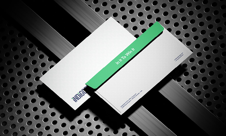
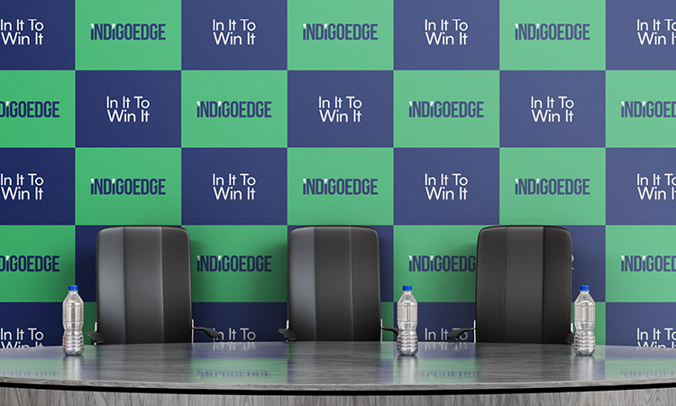
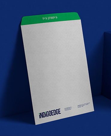
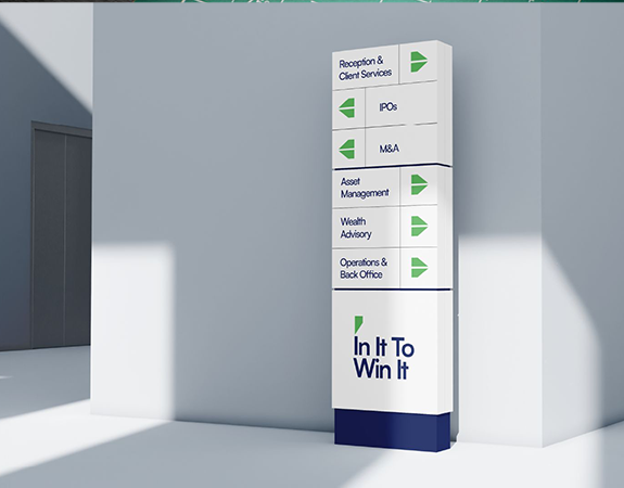
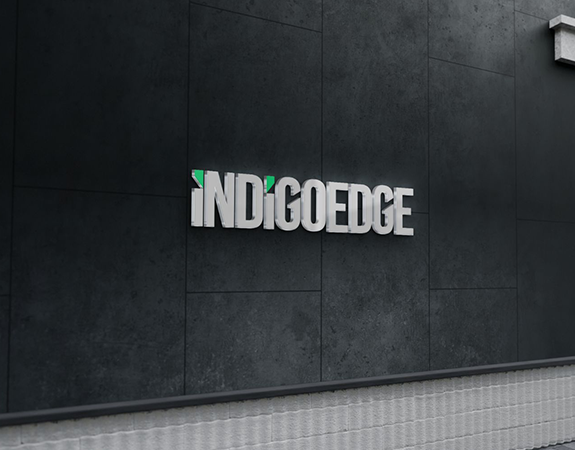
The IndigoEdge identity was designed to reflect partnership, precision, resilience, and growth. The logo concept centred around two “I” characters representing both IndigoEdge and the founders they stand beside, symbolising shared ambition and responsibility.
A subtle wolf-ear detail integrated into the “I” forms introduced the idea of the wolf pack mentality, representing loyalty, collaboration, strength, and strategic thinking. These elements were internally termed as the In-pins.
The colour palette reinforced the positioning of the brand:
- Deep blue represented trust, expertise, and confidence
- Growth green symbolised progress and financial success
The sharp geometric typography added a sense of decisiveness, precision, and forward momentum, reflecting IndigoEdge’s strategic and high-performance mindset.
Brand Expression
The verbal identity emerged from the realities of entrepreneurship and high-stakes decision making.
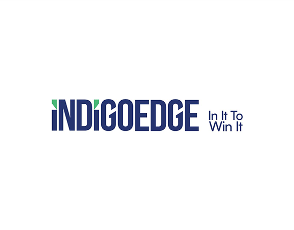
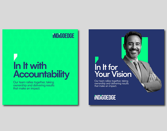
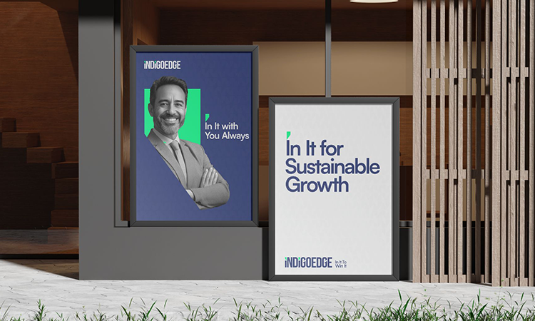
The expression: ‘In It’ captured IndigoEdge’s role as partners who stand beside founders through uncertainty, growth, and transformation.
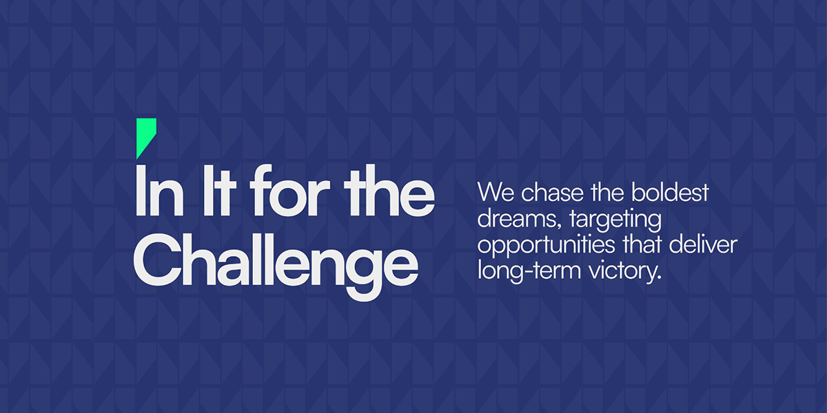
In It for the Challenge
In It for Sustainable Growth
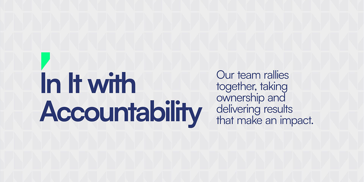
In It with Accountability
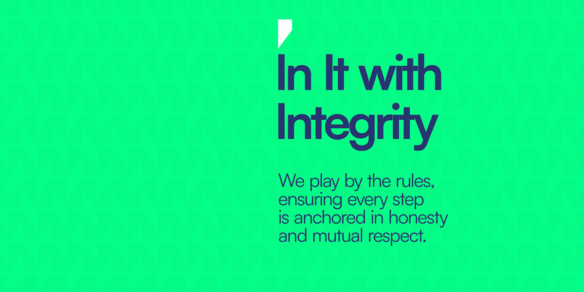
In It with Integrity
In It to Collaborate
Rather than functioning as external advisors, the brand positioned itself as a committed strategic ally deeply invested in every challenge and opportunity. This thinking extended across internal communication, employee culture, and stakeholder interactions.
The Outcome
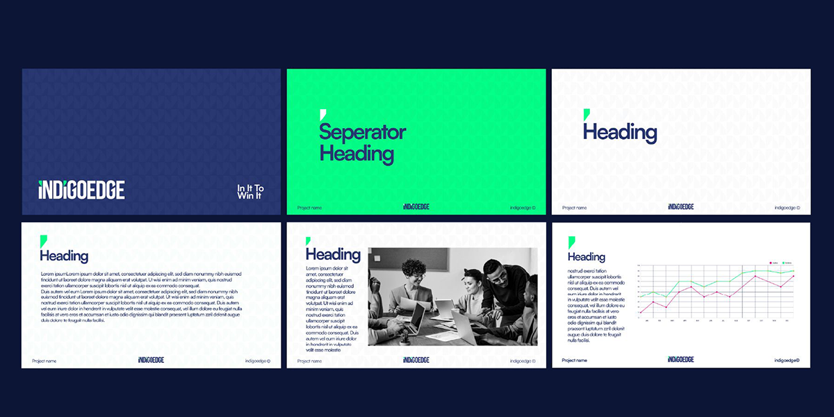
The result was a sharper, more purposeful identity system that aligned IndigoEdge’s vision, culture, and communication under one cohesive brand. The new identity helped articulate the firm’s strategic mindset and collaborative approach while strengthening internal alignment among employees and leadership.
More importantly, the transformation gave IndigoEdge a distinct voice in the investment banking space, positioning the firm as a trusted strategic partner focused on resilience, innovation, and long-term value creation.