Brand Purpose
De Mandarin exists to invite people to pause and discover. Rooted in the spirit of exploration, the brand brings diverse global cuisines together into one cohesive experience, where food becomes a gateway to culture, curiosity, and connection. Through thoughtful design and storytelling, De Mandarin encourages guests to slow down, savour flavours from around the world, and engage with dining as a meaningful journey rather than a routine act.
Brand Strategy
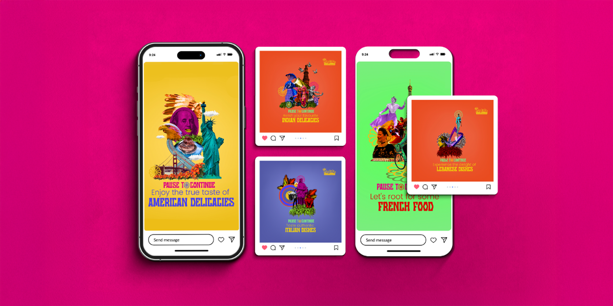
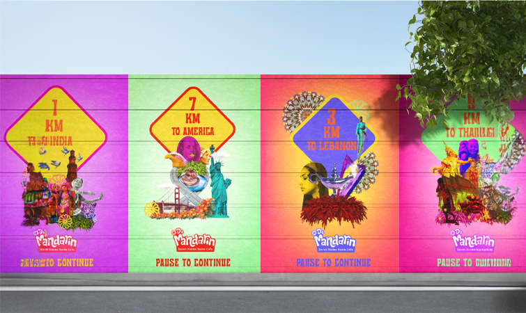
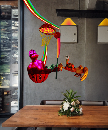
The strategy positioned De Mandarin as an experience-led café where pausing leads to exploration and cultural discovery. Seven global cuisines were unified under a single narrative, ensuring the brand felt cohesive rather than fragmented. Every touchpoint, from interiors and menus to uniforms, signage, and digital presence, was designed to support this story. A consistent visual system inspired by travel elements such as postcards and stamps reinforced movement and global connection, while bold colours and contemporary design reflected an urban, international lifestyle.
Brand Positioning
De Mandarin is positioned as a globally inspired café in Bangalore that offers more than food. It sits at the intersection of cuisine, travel, and storytelling, appealing to curious urban diners who value discovery and cultural experiences. Each visit is positioned as a journey, making the brand a destination rather than just a place to eat.
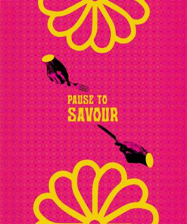
The Brand Idea
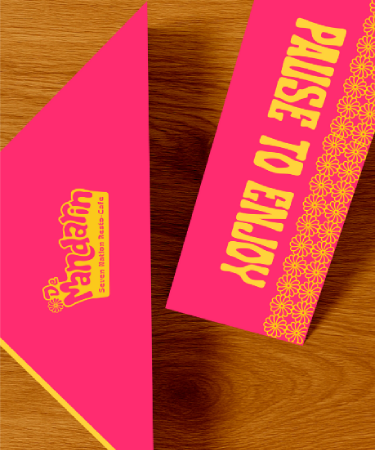
Pause to Discover: At the heart of De Mandarin is the belief that a pause is not an end, but a beginning. A moment that opens the door to curiosity, exploration, and cultural exchange. By combining global flavours with travel inspired storytelling, the brand transforms dining into an experience where every dish and detail invites discovery.
Brand Identity
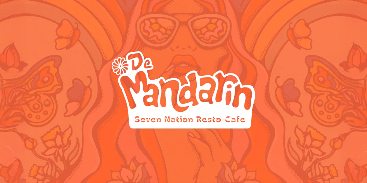
Logo Construction
The logo features fluid, rounded letterforms with a compact structure, ensuring strong visibility and recall across physical and digital applications.
Brand Expression
Vibrant, cosmopolitan, and story driven, the brand expression communicates warmth, curiosity, and global connection across all interactions.
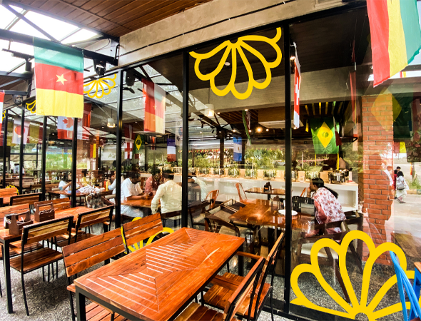
Pattern System
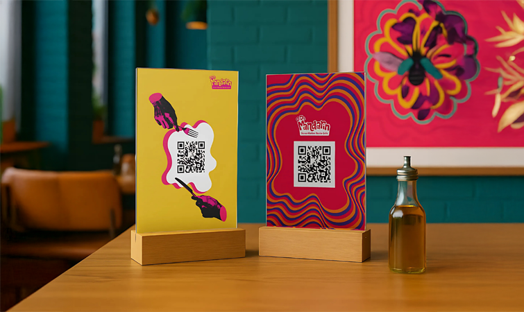
Inspired by travel and cultural motifs, the pattern system uses abstract stamps and illustrative elements to suggest movement and exploration, adding depth without overwhelming the identity.
Design Philosophy
Rooted in the idea of pause to discover, the design balances fun, modernity, and cultural richness, representing diversity within a unified visual language.
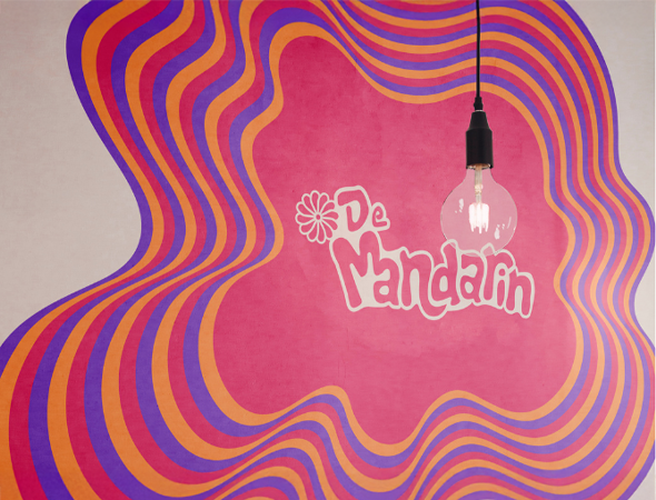
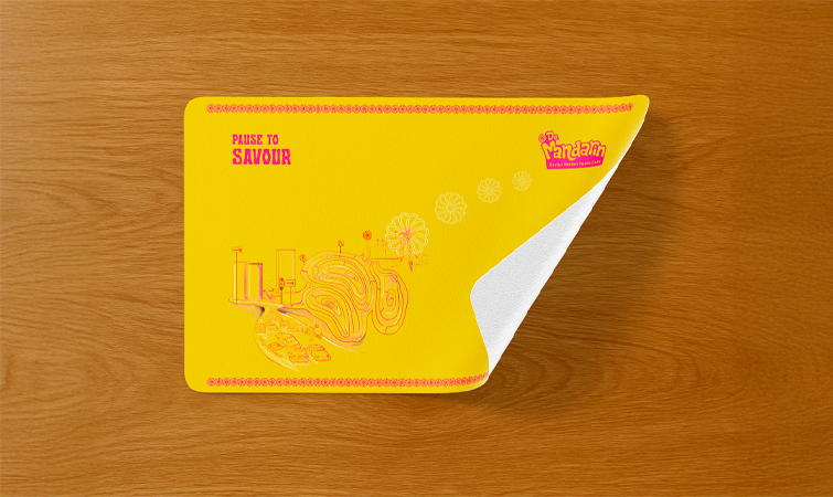
Colour Palette
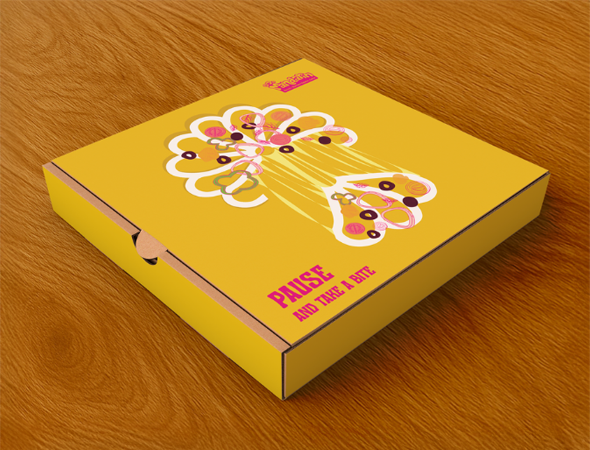
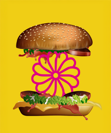
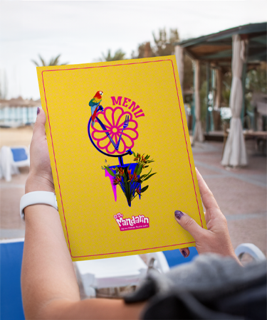
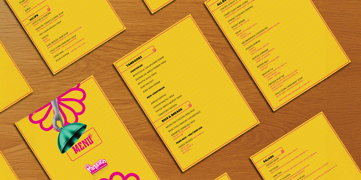
Bright, high energy hues led by pink and yellow evoke joy, appetite, and cultural vibrancy, helping the brand stand out in the café landscape.
Typography
Bold, rounded, and friendly typography reinforces accessibility and energy, remaining legible and adaptable across menus, signage, and digital platforms.
Impact
De Mandarin established a strong and memorable presence within Bangalore’s café scene by clearly differentiating itself as a global, narrative led destination. The cohesive brand identity unified seven international cuisines under one voice, strengthening recall, emotional connection, and customer engagement. By positioning dining as a journey rather than a transaction, the brand encourages repeat visits and builds a loyal community drawn to flavour, culture, and discovery.