The Challenge
Consolidated Gulf Company was one of Qatar’s leading diversified business groups with interests across mobile retail, telecom, IT, IT infrastructure, ITES, and engineering.
With ambitious growth plans ahead, the company wanted to consolidate its various businesses under one unified corporate identity. The challenge was larger than a visual redesign. The brand needed to move away from being perceived primarily as a Nokia distributor and mobile retailer and redefine itself as a future-facing corporate powerhouse.
The research and audits revealed two major issues:
The first challenge was perception. Despite its diversified capabilities, the company continued to be associated mainly with Nokia retail operations. The corporate brand lacked its own distinct identity and purpose.
The second challenge was inconsistency. The business was known by multiple names across audiences, leading to confusion and dilution of brand recall.
The need was clear: one unified brand with one clear purpose.
The Strategy
The rebranding exercise focused on creating a complete corporate revisioning process rather than just a cosmetic identity refresh.
The strategy was to reposition the company as a progressive organisation driving emerging technologies and contributing to the future of Qatar. The brand needed to think, behave, and communicate like a market leader.
The central strategic direction became:
One Brand. One Purpose.
This thinking helped unify the various group businesses under a singular identity while creating renewed clarity for employees, partners, and customers alike. The refreshed positioning shifted CGC from being seen as a traditional local business to a forward-looking corporate brand that inspires progress, innovation, and transformation.
The Brand Identity
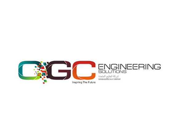
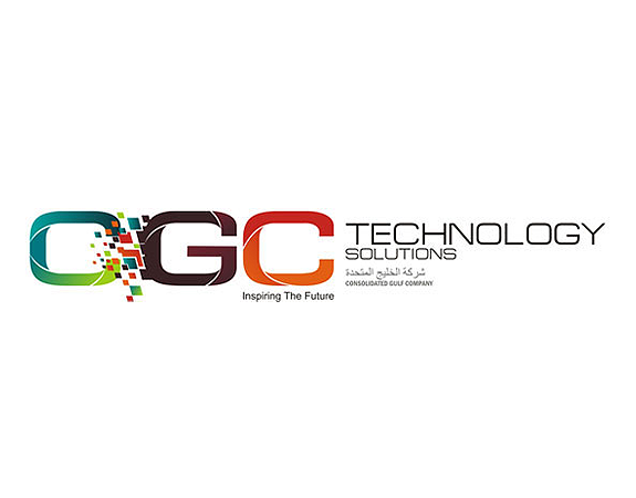
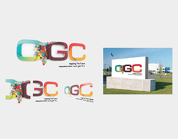
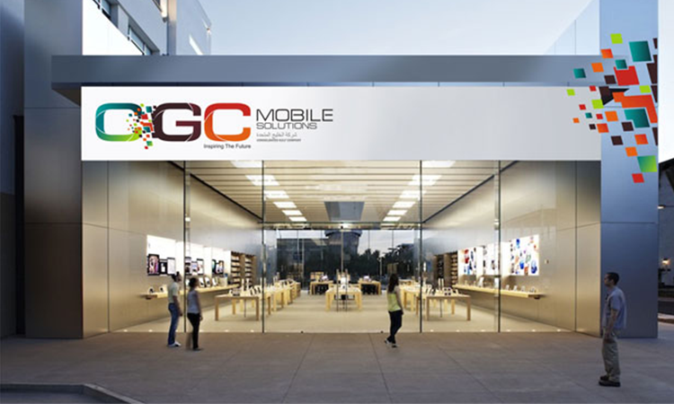
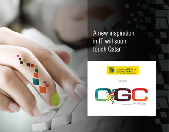
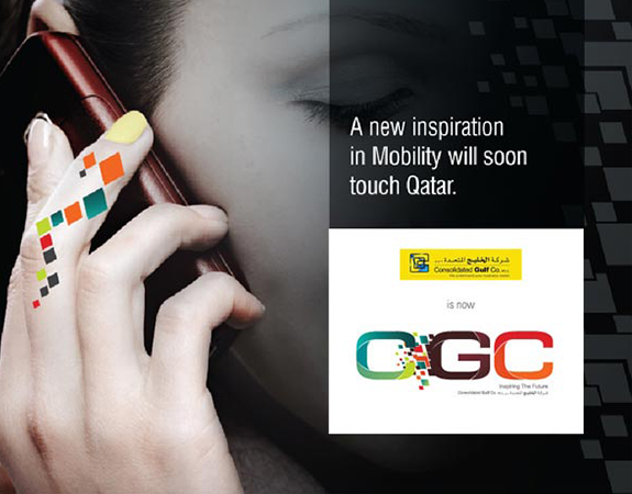
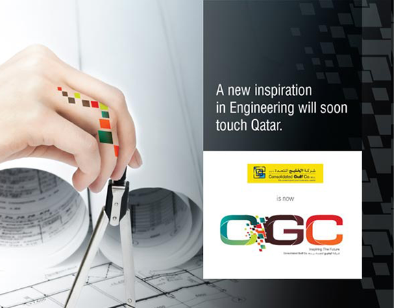
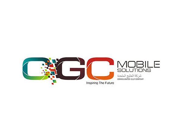
The visual identity was designed to reflect movement, progress, and future thinking. The name was simplified into CGC, creating a cleaner and more contemporary corporate identity system.
The logo became a visual metaphor for a dynamic and progressive future. The letter “G” was constructed using multiple futuristic forms coming together as one unit, symbolising collaboration, innovation, and a company powered by people.
The unconventional logo structure and typography reinforced the idea of CGC as a global and progressive organisation rather than a traditional corporate entity.
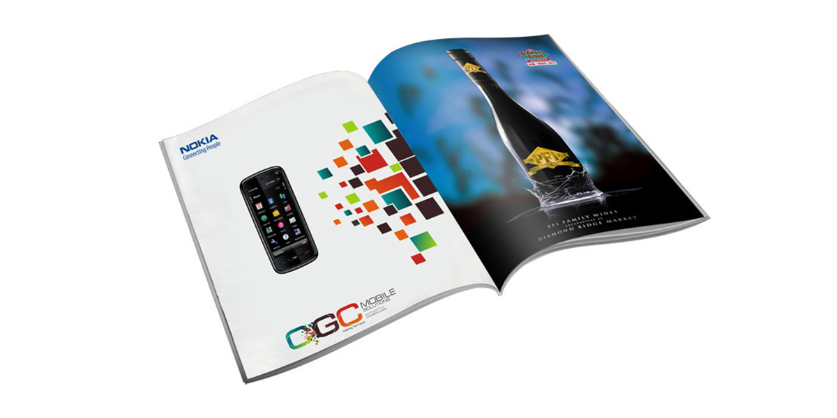
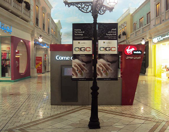
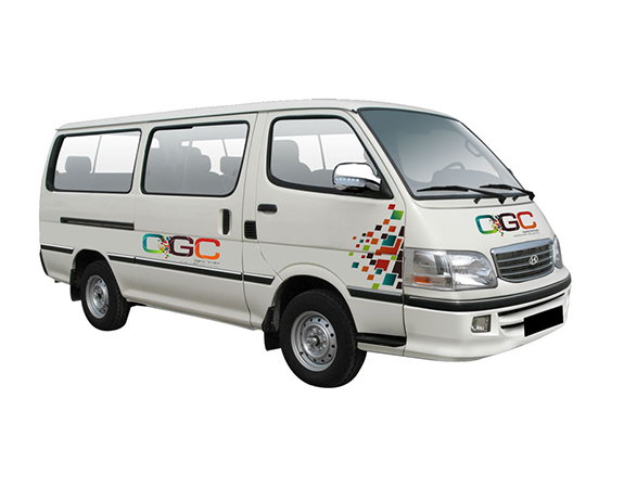
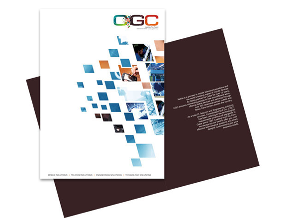
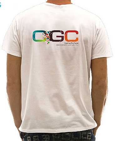
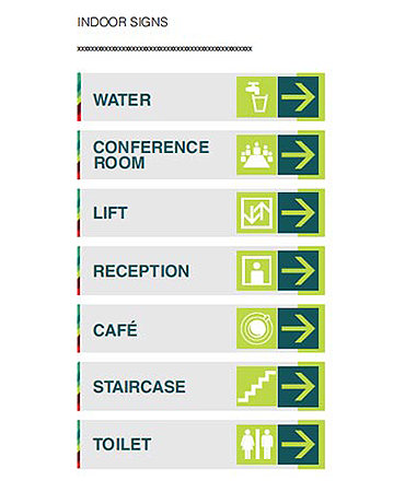
The visual language was then extended consistently across:
- Brand architecture
- Corporate stationery
- Signage systems
- Vehicle branding
- Corporate gifts
- Employee merchandise
- Relaunch campaigns
- Outdoor media
- PR communication packs
Every touchpoint was designed to create a unified corporate presence across the market.
The Outcome
The rebrand transformed Consolidated Gulf Company into a unified and future-ready corporate brand with a stronger sense of purpose and identity. By shifting perception away from a single retail association, CGC emerged as a progressive technology-driven conglomerate positioned for long-term growth.
The refreshed identity brought clarity across businesses, aligned internal teams under a shared vision, and introduced a more contemporary and confident corporate presence to the market.
More importantly, the transformation gave the company renewed energy, a stronger narrative, and a platform designed to inspire new futures.