Brand Purpose
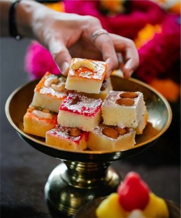
To reignite the romance and tradition of Indian sweets by making them relevant to the modern urban Indian. Anand Sweets sought to reclaim the cultural richness of mithai while elevating it for contemporary tastes. The vision was to refresh every consumer touchpoint, from packaging and in store experience to communication and brand programmes.
Brand Strategy
The strategy focused on re positioning Anand Sweets as a heritage led yet premium contemporary brand. We balanced long standing trust with modern sensibilities, ensuring relevance among younger urban audiences without alienating loyal patrons. A comprehensive identity overhaul created consistency across packaging, retail signage, and brand communication. Emotional storytelling around celebration, authenticity, and craftsmanship became central, helping the brand stand apart in a crowded market.
Brand Positioning
Anand Sweets is positioned as a premium Indian sweets brand rooted in tradition and elevated for modern lifestyles. The brand stands for purity, craftsmanship, and heritage, while seamlessly fitting into contemporary gifting and celebratory occasions.
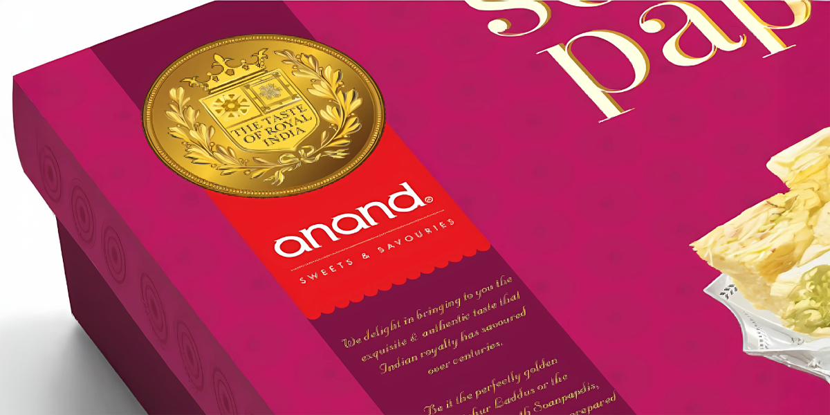
The Big Idea
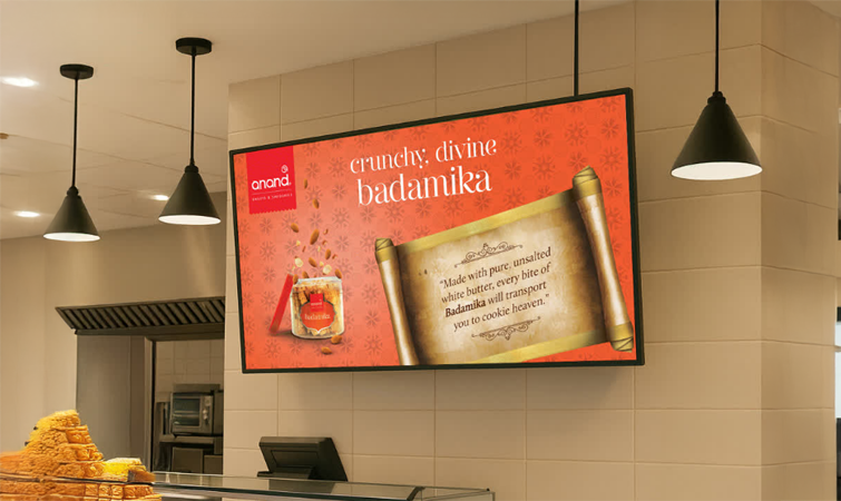
The central idea, The Taste of Royalty, was designed to revive the grandeur and nostalgia associated with Indian sweets. Drawing from royal Indian heritage, it transforms everyday mithai into an indulgent, celebratory experience. The Seal of Royalty was introduced as a distinctive brand property that signifies authenticity and uncompromising quality.
Brand Identity
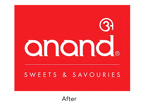
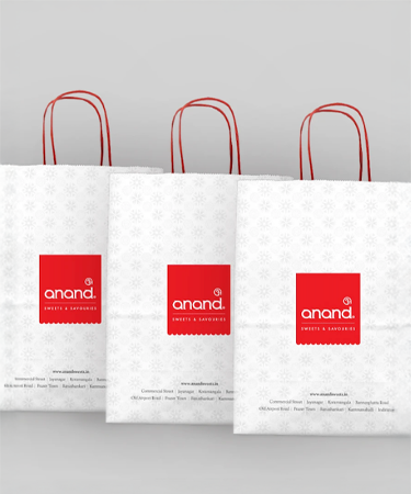
Logo Construction
The logo is built around a custom lowercase wordmark, creating warmth and approachability. A Devanagari symbol of Om is integrated, reinforcing Indian roots and purity.
Brand Expression
A refined blend of Indian heritage and contemporary premium appeal, evoking trust and celebration.
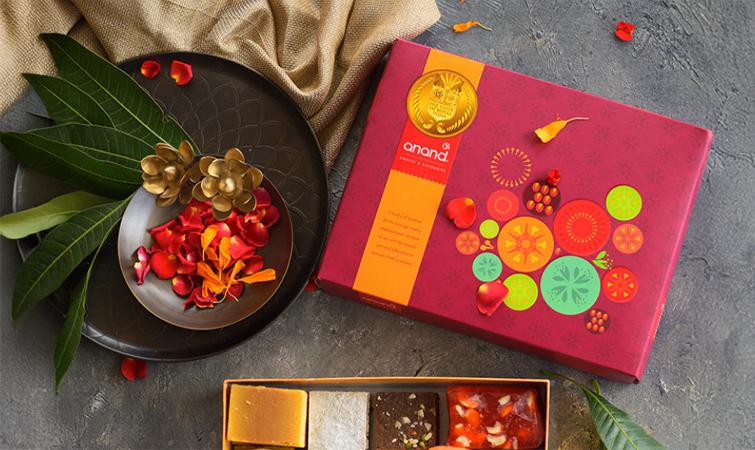
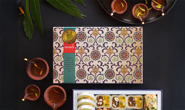
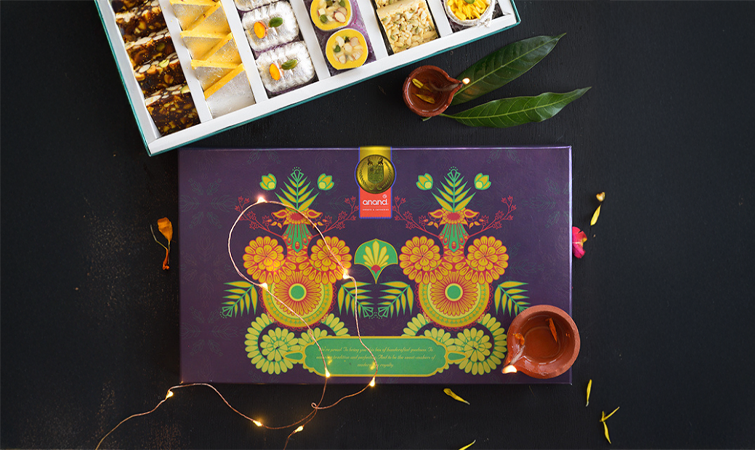
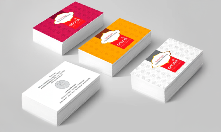
Pattern System
Inspired by traditional Indian decorative motifs and sweet box aesthetics, using repetitive geometric and scalloped forms to convey festivity and craftsmanship.
Design Philosophy
Focused on clarity, premium finishes, and emotional storytelling, ensuring a timeless identity.
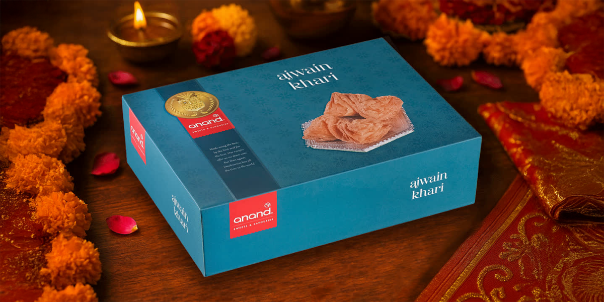
Colour Palette
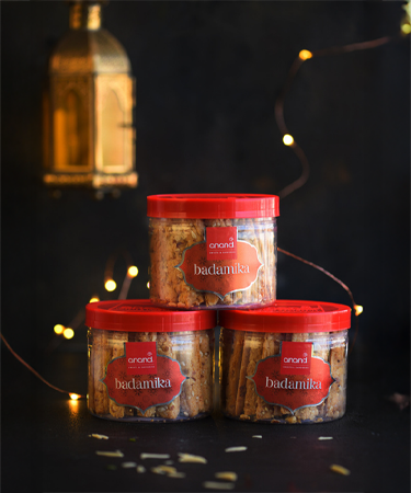
A bold red anchors the identity, symbolising celebration, tradition, and appetite. Neutral tones such as cream, beige, and gold add warmth and refinement.
Typography
A custom serif based lowercase typeface reflects heritage and elegance.
Impact
The rebranding transformed Anand Sweets from a conventional sweet shop into a distinctive premium brand. A contemporary Indian visual language helped carve a unique space in the minds of urban consumers, strengthening gifting relevance and supporting market growth. Anand Sweets emerged as a brand that celebrates tradition with pride, attracting a loyal tribe of urban sweets aficionados seeking an elevated experience.