Brand Purpose
From the house of dormakaba and evolving from Dorma XL C, AIDO XL C was envisioned as an agile, customer facing security brand with a strong retail focus. While staying true to its legacy of engineering excellence, the brand set out to explore new growth opportunities through aggressive market expansion and partner network development. Its purpose is clear: to protect every place that matters through foolproof, innovative access solutions built on trust and performance.
Brand Strategy
The strategy focused on positioning AIDO XL C as a brand that stands for zero failure and absolute reliability. Backed by dormakaba’s credibility, the brand was built around door centric access solutions as its core offering. Extensive audits across management, employees, retailers, customers, and the market informed a robust foundation. The name AIDO, derived from I DO, became a powerful articulation of responsibility and assurance. Consistency across all touchpoints ensured the brand communicated safety, strength, and unity at every level.
Brand Positioning
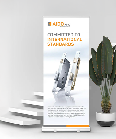
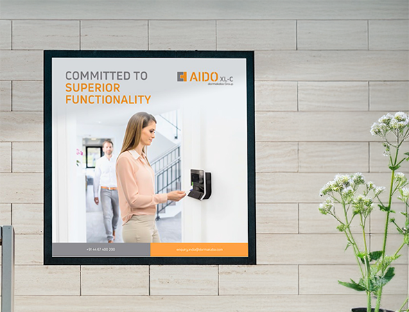
AIDO XL C is positioned as a premium safety and security brand delivering uncompromising protection for homes and people. With innovative access solutions and a door centric approach, the brand promises reliability that does not fail. The association with dormakaba reinforces trust, while the philosophy of I DO reflects confidence, accountability, and action over words. AIDO XL C stands as a dependable, future ready solution for those who prioritise long term safety.
The Idea
At the heart of AIDO XL C lies the promise of foolproof safety through unwavering commitment. The meaning of AIDO as I DO defines the brand’s mindset, a declaration of responsibility and assurance. By combining trusted engineering expertise with modern access innovation, the brand communicates that true security is demonstrated through performance, not claims. Bloombox supported this journey through extensive audits and strategic inputs, shaping a clear brand strategy and identity system.
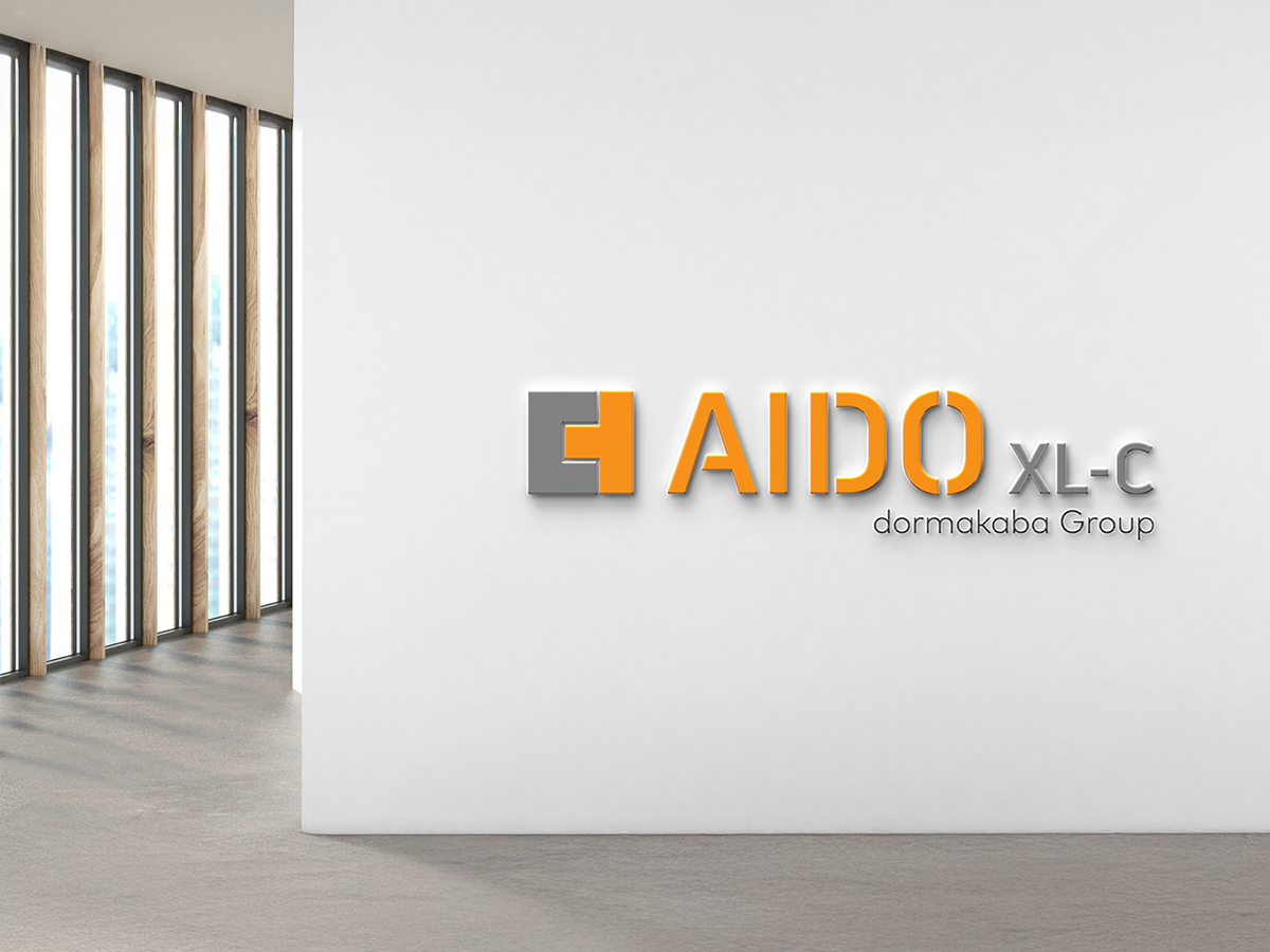
Brand Identity
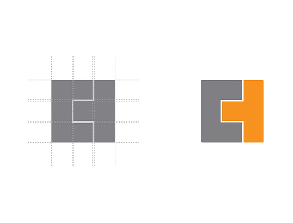
Logo Construction
The logo is constructed from two precise geometric forms that align seamlessly into a single, strong unit, symbolising perfect fit, precision, and secure access.
Brand Expression
Bold, confident, and purposeful, expressing assurance, innovation, and reliability across every touchpoint.
Pattern System
Derived from the logo’s angular geometry, reflecting access points, alignment, and connectivity.
Colour Palette
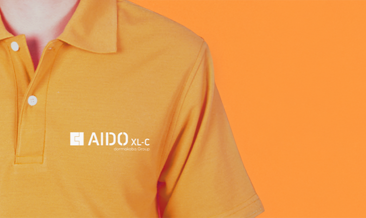
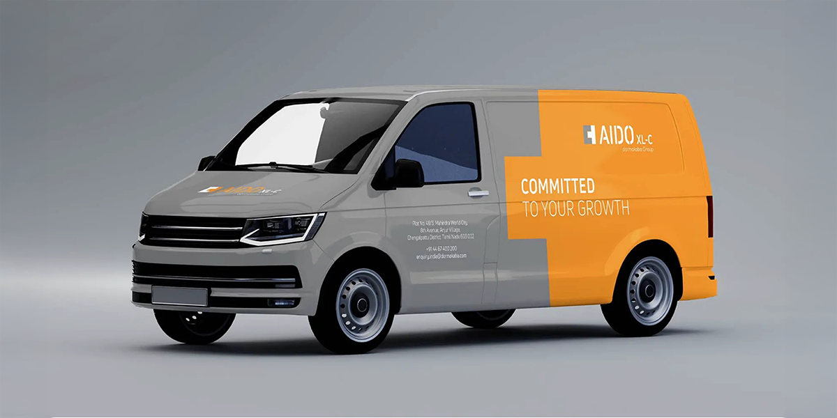
Grey conveys stability, durability, and technological strength, while orange introduces energy, alertness, and confidence.
Design Philosophy
Rooted in commitment and performance, ensuring every visual element reinforces trust and dependability.
Typography
Clean, modern sans serif typefaces that communicate clarity, precision, and professionalism.
Impact
AIDO XL C established itself as a trustworthy and foolproof security brand through a clear positioning and strong visual identity. The brand’s association with dormakaba strengthened confidence among customers, retailers, and stakeholders, while its commitment driven messaging enhanced recall and credibility. As a result, AIDO XL C influences purchase decisions, builds long term loyalty, and reinforces its standing as a durable, future ready solution for access and door security.