The Challenge
In a market crowded with mass-produced and commoditised ghee brands, Nambisan’s needed to reclaim and communicate what truly set it apart.
With a legacy spanning 92 years, the brand had a powerful story rooted in authenticity, traditional craftsmanship, and a meticulous four-day granulation process. However, the existing communication lacked a contemporary positioning that could connect with conscious modern consumers while preserving the brand’s heritage.
The challenge was to create a renewed visual language and brand positioning that could:
- Re-establish Nambisan’s as the original and purest form of ghee
- Communicate the value of slow, artisanal craftsmanship
- Appeal to consumers embracing mindful and conscious living
- Balance heritage with a modern premium identity
- Build a stronger emotional connection beyond product functionality
The Strategy
The repositioning centred around a defining belief:
Ghee was never meant to be rushed.
This became the foundation for reshaping the brand’s identity and communication system. The strategy focused on elevating Nambisan’s beyond a traditional dairy product into a symbol of slow living, mindful choices, and uncompromised authenticity.
At the heart of the brand stood its meticulous four-day granulation process, a time-honoured method that preserves the texture, aroma, nutrition, and integrity of authentic ghee.
The refreshed positioning brought together:
- Traditional craftsmanship
- Conscious living
- Slow food philosophy
- Heritage and trust
- Purity and precision
This led to a sharper and more differentiated brand expression:
Not any ghee. Slow Ghee.
The Big Idea
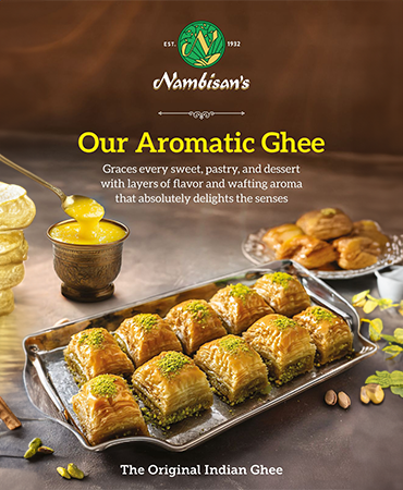
The Original Indian Ghee
Nambisan’s was positioned as:
- A heritage-led artisanal ghee brand
- A celebration of slow craftsmanship
- A symbol of mindful and conscious living
- A brand rooted in purity, granulation, and authenticity
- A modern interpretation of timeless Indian food traditions
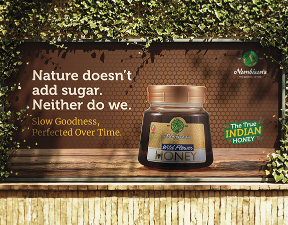
The communication embraced the philosophy of slowness as a mark of quality, care, and integrity.
Through messaging such as:
- The art of slow, the taste of life
- Four days to perfection
- Crafted with patience, made with purpose
- Ghee, the way it was always meant to be
the brand transformed from a product into a philosophy.
Bringing It to Life
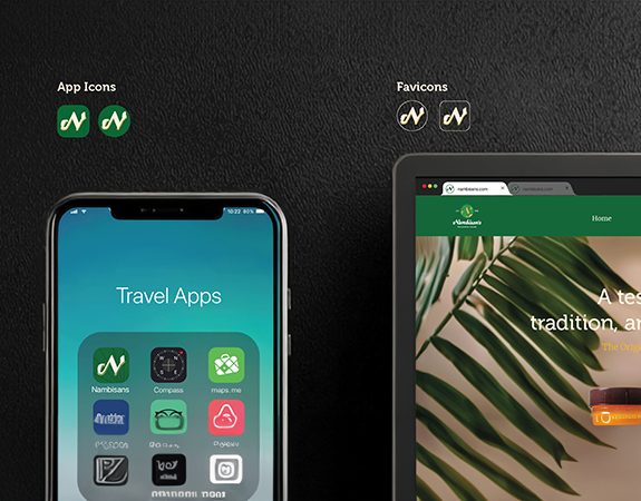
- Visual Identity & Brand Language
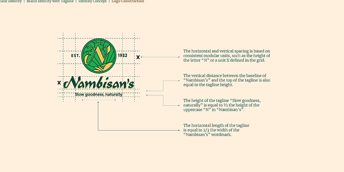
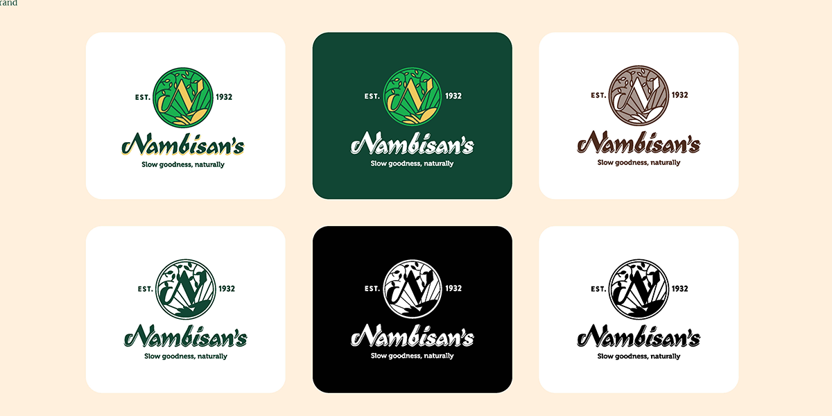
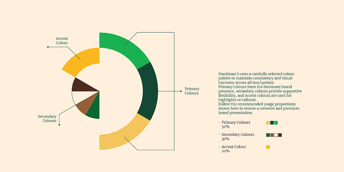
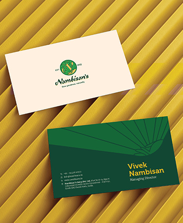
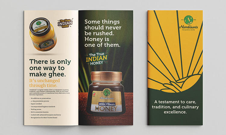
A refreshed visual language was developed to reflect the brand’s artisanal and meticulous nature.
Built through:
- A cleaner, premium brand expression
- Heritage-inspired storytelling
- A warm and authentic communication tone
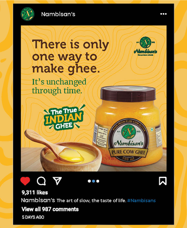
- Messaging rooted in slowness, purity, and craftsmanship
- Contemporary visual systems that balanced legacy with modernity
The identity reflected the essence of the brand:
Unrushed. Unhurried. Slow.
- Brand Philosophy
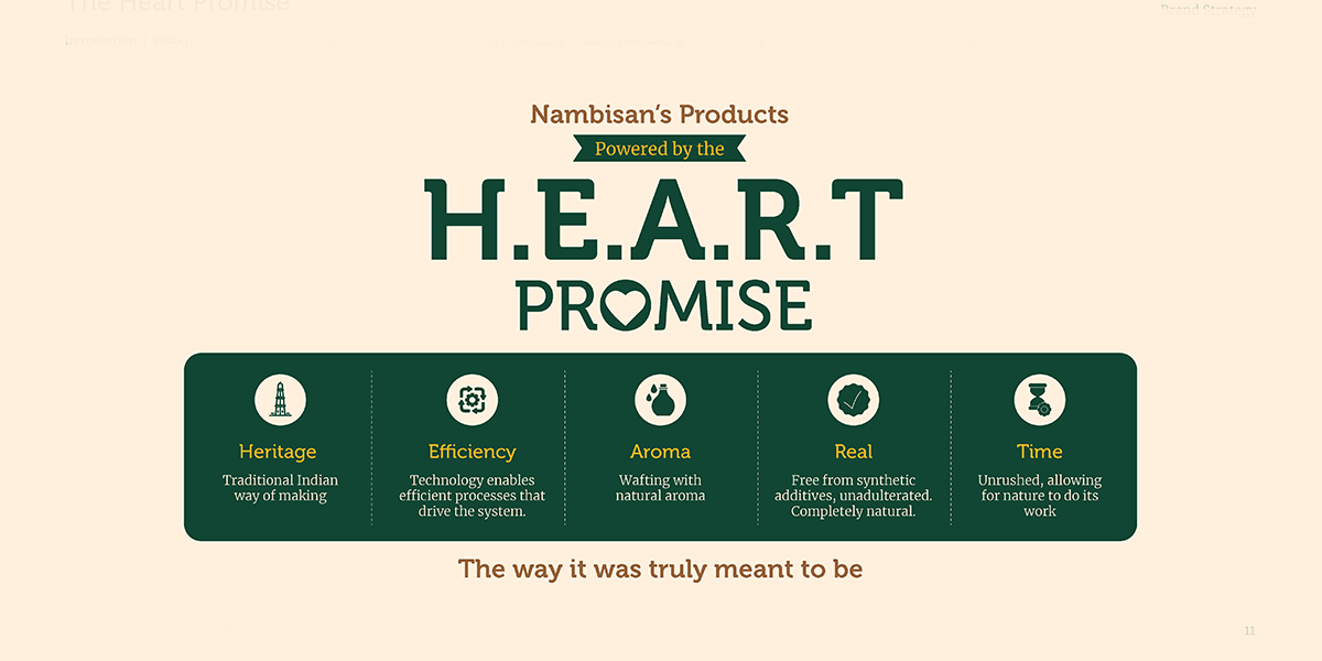
The repositioning drew from the five defining virtues of true ghee:
- Purity
- Hygiene
- Time
- Granulation
- Nutrition
These principles became the foundation for the brand narrative and communication ecosystem. The storytelling celebrated every stage of the process from sourcing pure dairy butter to the slow cooking and four-day granulation method that gives Nambisan’s its signature golden hue, grainy texture, and rich aroma.
- Consumer Connection
The refreshed positioning aimed to resonate with a new generation of conscious consumers seeking authenticity, quality, and mindful food choices. The communication framed Nambisan’s not merely as an ingredient, but as:
- A return to intentional living
- A bridge between tradition and innovation
- A celebration of nourishment and care
- An everyday expression of heritage and wellness
The Outcome
Nambisan’s evolved into more than a legacy ghee brand. It became a contemporary expression of slow living and artisanal authenticity. Through a renewed positioning and refreshed visual language, the brand successfully reinforced its heritage while creating relevance for modern consumers who value mindful choices, craftsmanship, and purity.
A brand rooted in tradition.
Crafted slowly for today.