The Challenge
BTI Payments, part of Banktech Australia, was among the few companies licensed by the RBI to launch White Label ATMs in India. The larger ambition was not just to introduce another ATM network, but to make self-banking more accessible across Tier III to Tier V towns and villages.
The challenge was significant.
The brand needed to:
- Build trust among audiences unfamiliar with white label ATMs
- Create relevance across India’s cultural and linguistic diversity
- Overcome existing gaps in service expectations and delivery
- Establish a strong emotional and functional connection with users
The goal was to create a brand that people could identify with beyond just banking infrastructure.
The Strategy
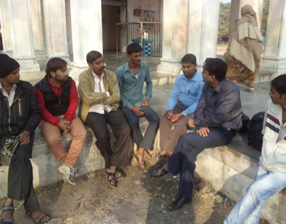
The strategy was built on deep consumer understanding. An extensive 360-degree research process was conducted across smaller towns in Tamil Nadu, Karnataka, Gujarat, and Western Uttar Pradesh in association with MART, New Delhi.
The study explored:
- Consumer behaviour
- Adoption barriers towards a new banking concept
- Existing fears and trust gaps
- Emotional triggers that could encourage usage and acceptance
The key insight was clear:Differentiation would not come through functionality alone.
The brand had to work at two levels:
- Functional trust and performance
- Emotional and cultural relatability
The objective became creating a brand that people could trust, identify with, and emotionally connect to.
The Idea
The central idea emerged as: One India. One ATM.
The positioning reflected a larger ambition of bridging the service and accessibility gap between urban and rural India.
India1 ATM was designed as a symbol of:
- Financial equality
- Accessibility
- Trust
- Ease and control
- Freedom from compromise
The brand identity played a critical role in bringing this idea to life.
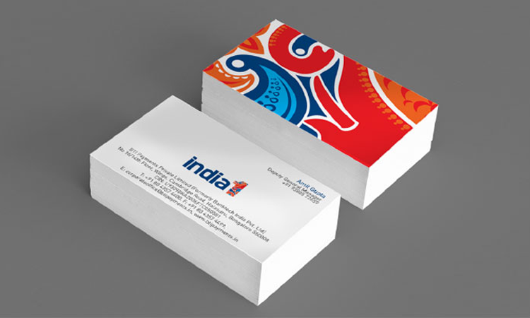
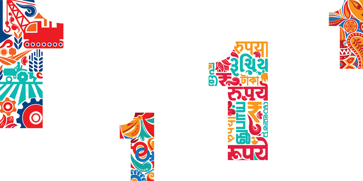
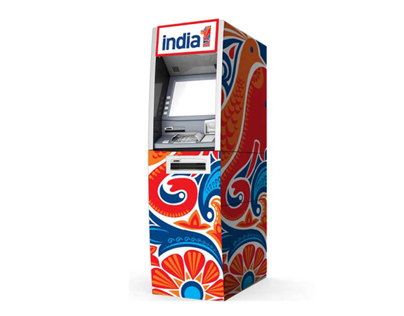
The “1” in the logo became more than a numeral. It evolved into a symbolic representation of unity, diversity, and progress. The intricate Indian-inspired artwork within the “1” reflected the cultural richness and diversity of the country, while also reinforcing the idea of one connected India.
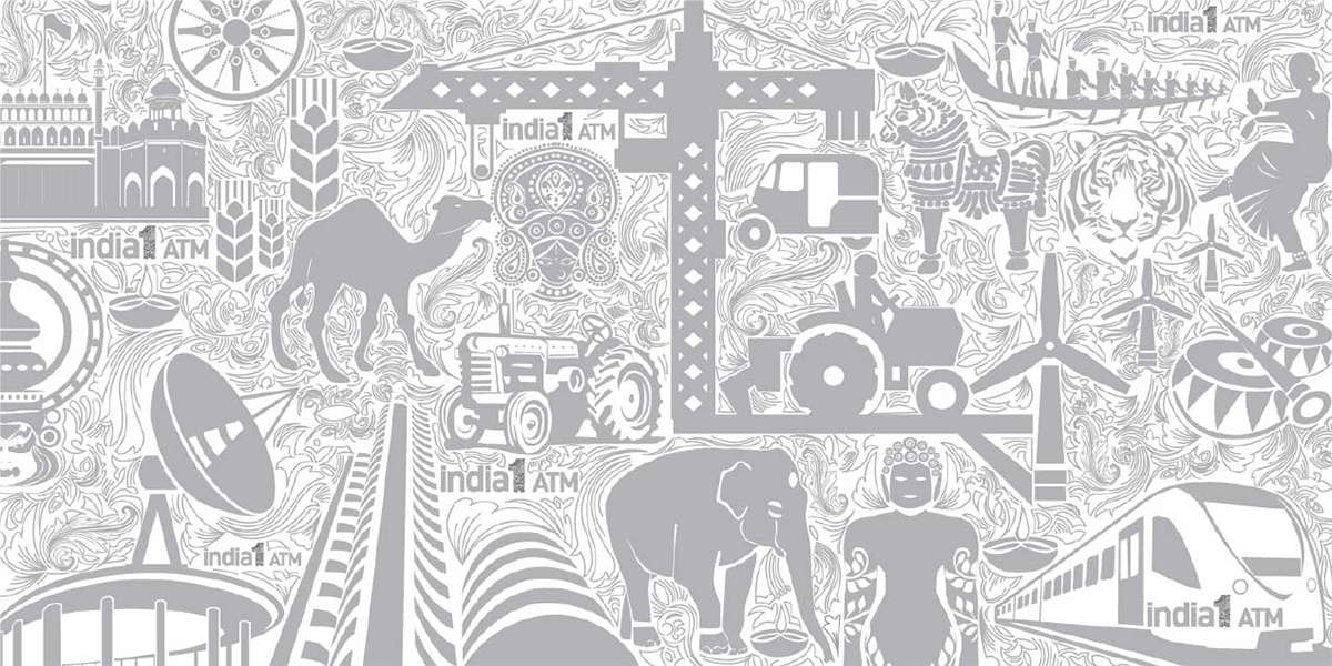
This visual language extended across kiosk design, branding systems, and communication, helping the network feel approachable, familiar, and rooted in the lives of everyday Indians.
The Action Plan
The brand ecosystem was designed to go beyond ATM transactions and become a more integrated service experience for rural consumers.
The larger rollout strategy included:
- Mobile recharges
- Bill payment services
- Insurance tie-ups
- Promotional partnerships with local businesses and national brands
To drive engagement and encourage adoption, initiatives like the “India1 ATM Celebration” campaign were conceptualised, offering rewards such as cars, smartphones, gold coins, and talktime.
The communication strategy positioned the ATM not merely as a banking machine, but as an empowering access point to financial freedom and convenience.
The Outcome
India1 ATM emerged as a culturally rooted and emotionally resonant banking brand designed specifically for the realities of rural and semi-urban India. By combining deep consumer insight with a powerful symbolic identity system, the brand created a strong foundation for trust, familiarity, and accessibility.
More than introducing white label ATMs, the project helped shape a brand that stood for inclusive banking and the idea of bringing true financial equality closer to millions of Indians.