The Challenge
Manappat Group operates across the Middle East, the United Kingdom, and India, spanning EPC, trading, manufacturing, and future-focused technology.
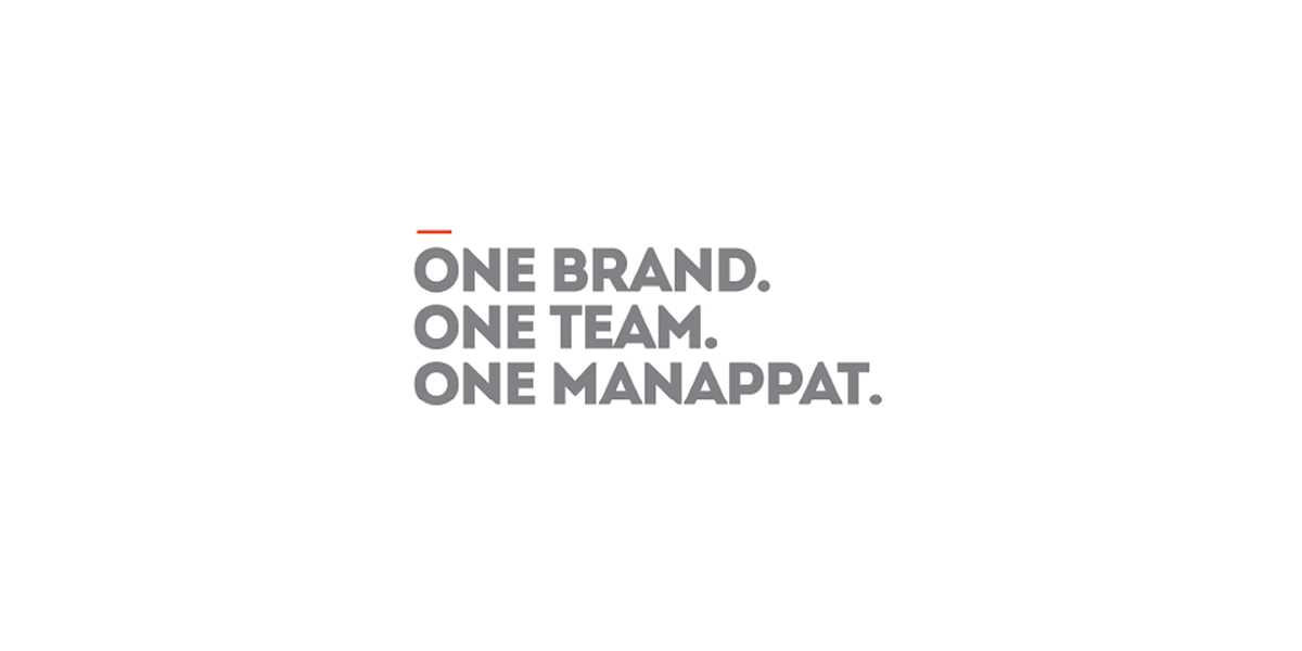
The challenge was to unify this diverse ecosystem under a single brand—one that could create synergy across businesses while reflecting the Group’s forward-thinking nature and collective strength.
Brand Strategy
The approach focused on building a unified identity for a multi-industry organisation.
To bring coherence across sectors
To establish a shared vision across subsidiaries
To reflect a progressive, future-facing group
The Idea
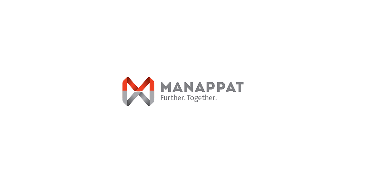
The brand draws from the idea of infinity. A symbol of continuity, unity, and endless possibility. It reflects the Group’s belief in seamless collaboration and its ongoing pursuit of growth. The form also subtly echoes the letter ‘M’, grounding the idea in the brand itself.
Logo Story
The identity is built around an infinite, unending form. Inspired by the infinity symbol, the mark represents:
Continuous progress
Unending growth
Togetherness across businesses
It reflects the idea of multiple entities coming together as one, forming a unified, forward-moving system. A visual expression of ambition, passion, and collaboration at scale.
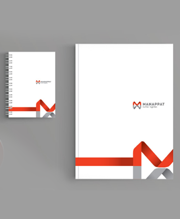
Visual Identity
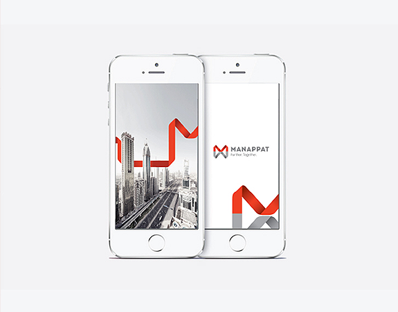
The visual language extends this idea of infinity into a bold, multi-dimensional system. A vibrant, continuous form that communicates:
Movement
Energy
Growth
Unity
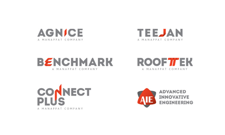
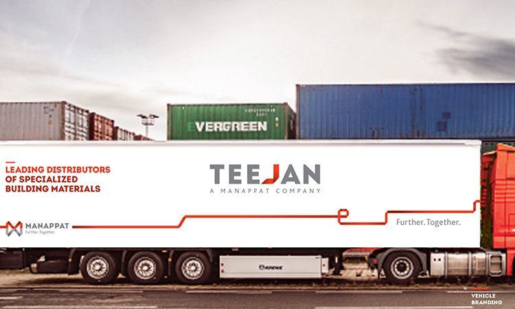
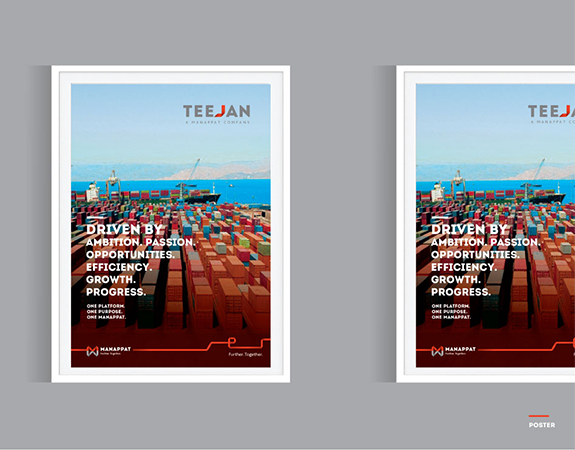
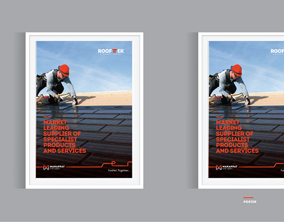
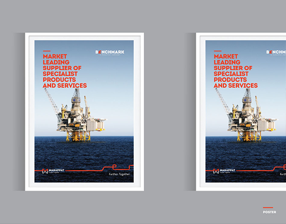
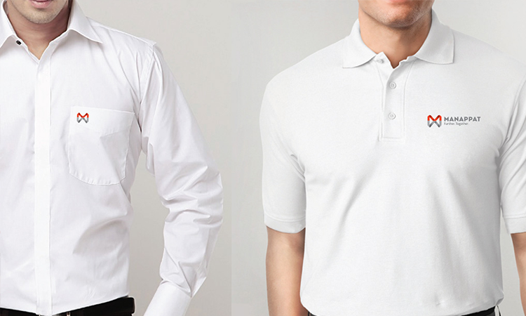
The identity creates a consistent and impactful presence across all businesses, reinforcing a strong, cohesive group image while allowing scale and adaptability.
Outcome
The rebranding brought clarity, cohesion, and direction. A unified identity now connects all subsidiaries under a shared narrative of progress. It strengthened internal alignment, encouraged collaboration, and built a stronger sense of belonging.
Externally, the Group presents a consolidated, confident image—opening up new opportunities for partnerships and growth. A single idea, holding together an entire ecosystem.