The Challenge
Red Road Healthcare Business Solutions provides expert clinical back-end services that help companies in the US achieve greater business efficiencies.
As the brand set out to expand its clientele in the US market, it needed a sharper identity and a stronger presence. The brand also had no visibility on LinkedIn, making it essential to establish a credible and consistent digital footprint for a niche audience. This called for a focused healthcare rebranding solutions approach.
The Strategy
As a healthcare branding agency, we used our proprietary Brand Trinity model, combining brand audits, SWOT analysis, and competitor analysis to distill the core of the brand. This led to a clear and differentiated positioning:
Not a partner. Not an associate. An extended team.
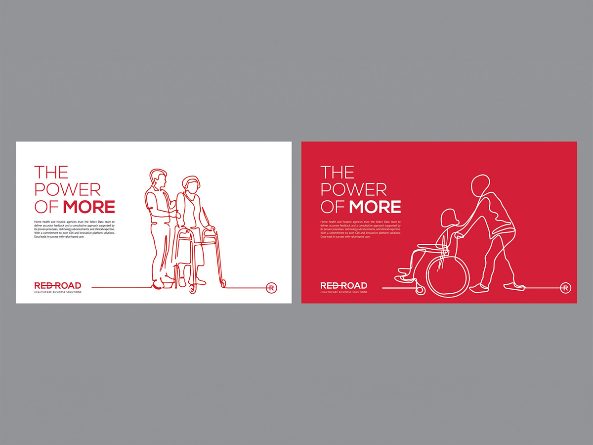
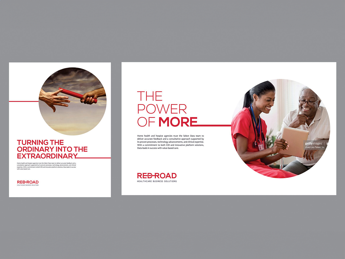
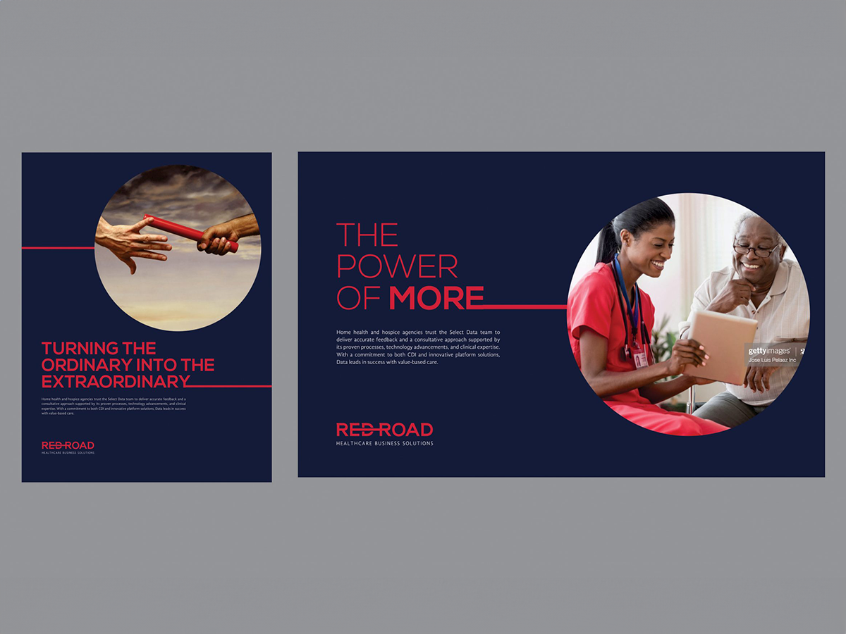
From this, the central brand idea emerged: The Power of More
This idea became the foundation for everything that followed, from identity to communication, giving Red Road a strong and consistent way to present itself to the market.
Brand Identity & Visual Language
The identity was built to express the idea of connection, support, and collective progress.
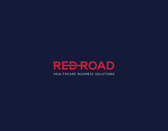
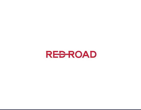
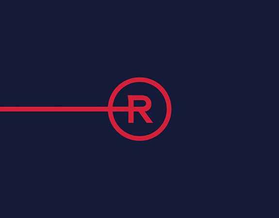
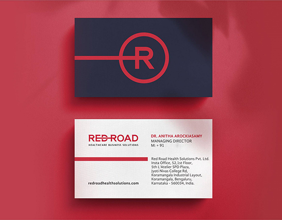
Logo Concept
The logo draws inspiration from an arm reaching out and hands joining. It represents the role Red Road plays in supporting, uplifting, and accomplishing more together with its clients.
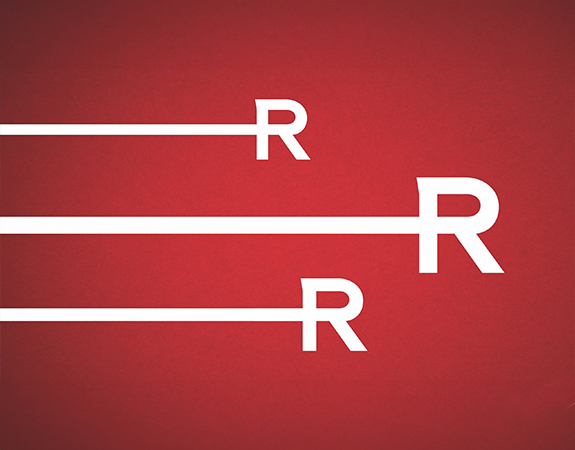
Visual Device
A strong horizontal line cuts across the brand language, acting as a connector. It reflects alignment, continuity, and the idea of joining forces.
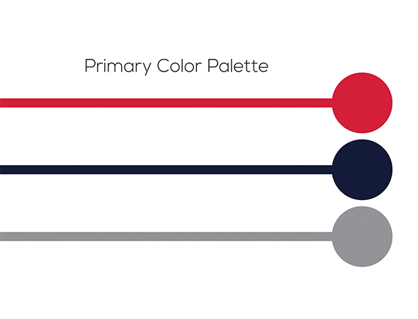
Colour Palette
A bold red anchors the identity, conveying energy, action, and intent, supported by deeper tones that bring balance and stability.
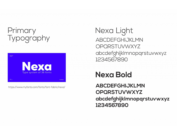
Typography
Clean and modern typography ensures clarity and consistency across communication.
Messaging System
Phrases like;
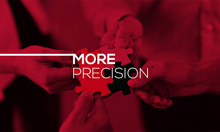
- More Precision
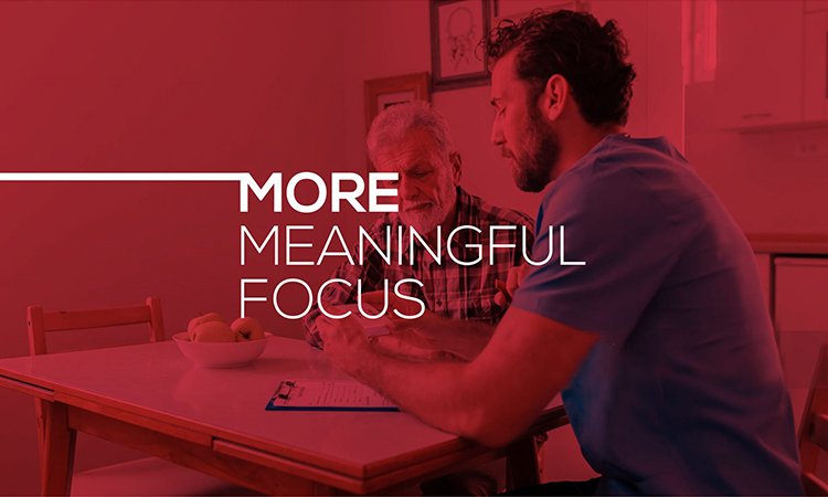
- More Meaningful Focus
- The Power of More
- More Accomplishment
extend the brand idea into everyday communication, reinforcing the value Red Road brings to its clients.
The Idea & Content
The key insight was clear. Organisations were skeptical about outsourcing clinical services, with concerns around transparency and cost effectiveness. Instead of a sales-led approach, the communication focused on addressing these concerns directly. The messaging spoke to real problems and offered constructive, solution led perspectives.
This approach helped the brand connect with its audience in a more meaningful and relevant way.
Digital Strategy
The focus was to build visibility on LinkedIn among a niche US audience. We used industry specific account based targeting and directed campaigns based on location, organisations, and designations. The goal was to create awareness, establish credibility, and build a consistent brand presence.
The Outcome
Red Road reintroduced itself with a refreshed identity, a clear brand idea, and a consistent visual and verbal language.
The campaign delivered:
305,965 impressions
0.13 percent average CTR
76.8 percent increase in LinkedIn followers
The result was a measurable shift in visibility and engagement, helping Red Road build its tribe on LinkedIn and connect with its target audience in the US. As a best branding agency for healthcare, the focus was not just on visibility, but on building trust, clarity, and long term relevance in a highly specialized category.